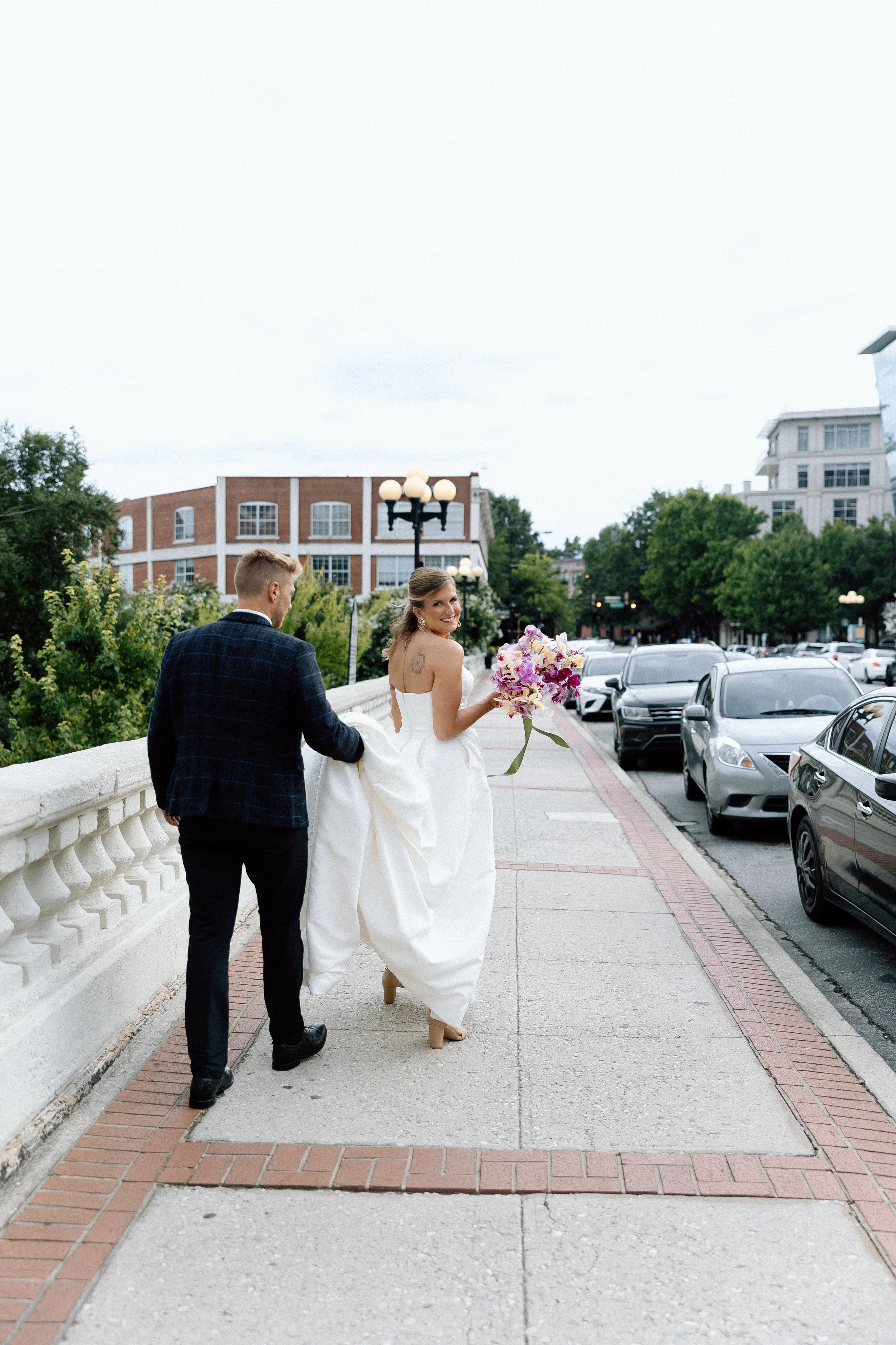
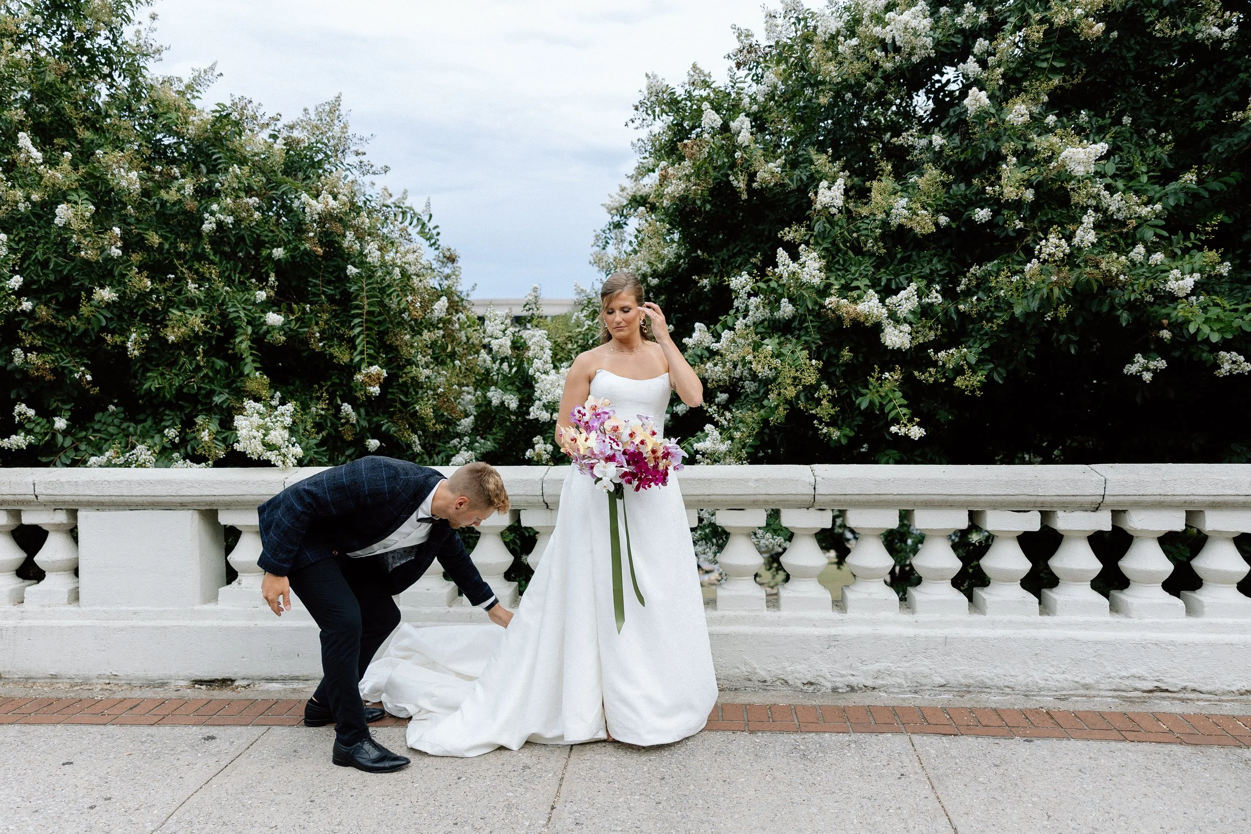
Styled Shoot at Seratonic Lounge in Downtown Greenville SC
Venue: Seratonic Lounge
Planner: Crystal Williams Events
Designer & Florist: Rachel Deneroy Designs
Photographer: Taylor Parker Photography
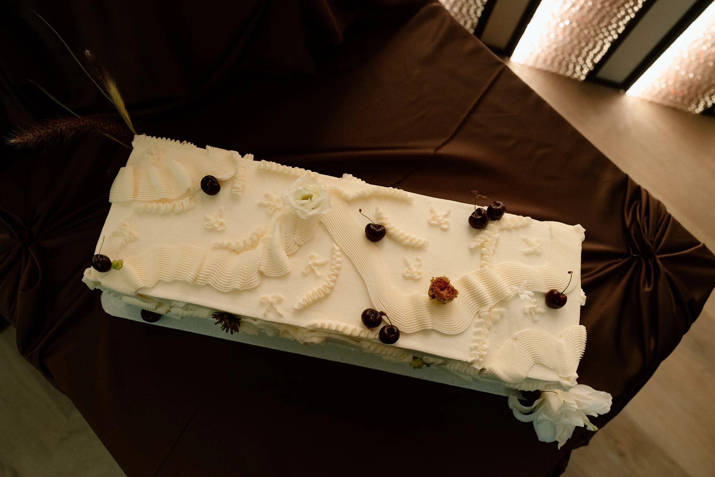
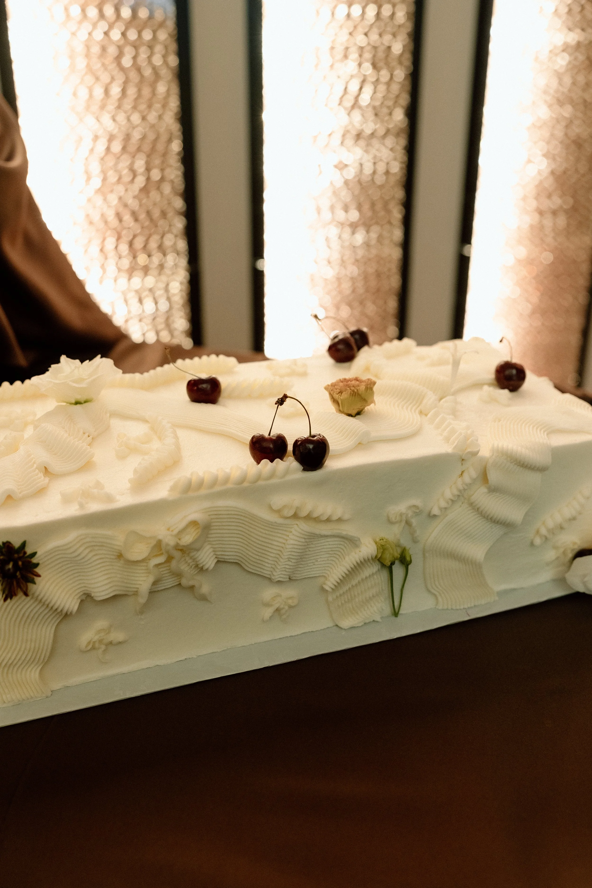
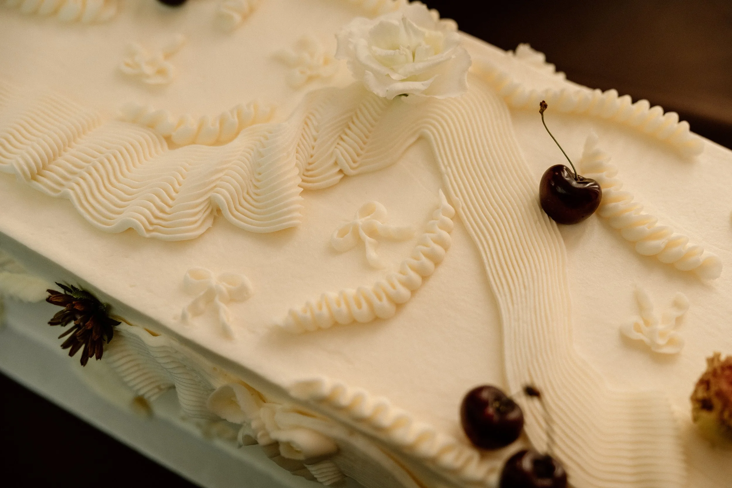
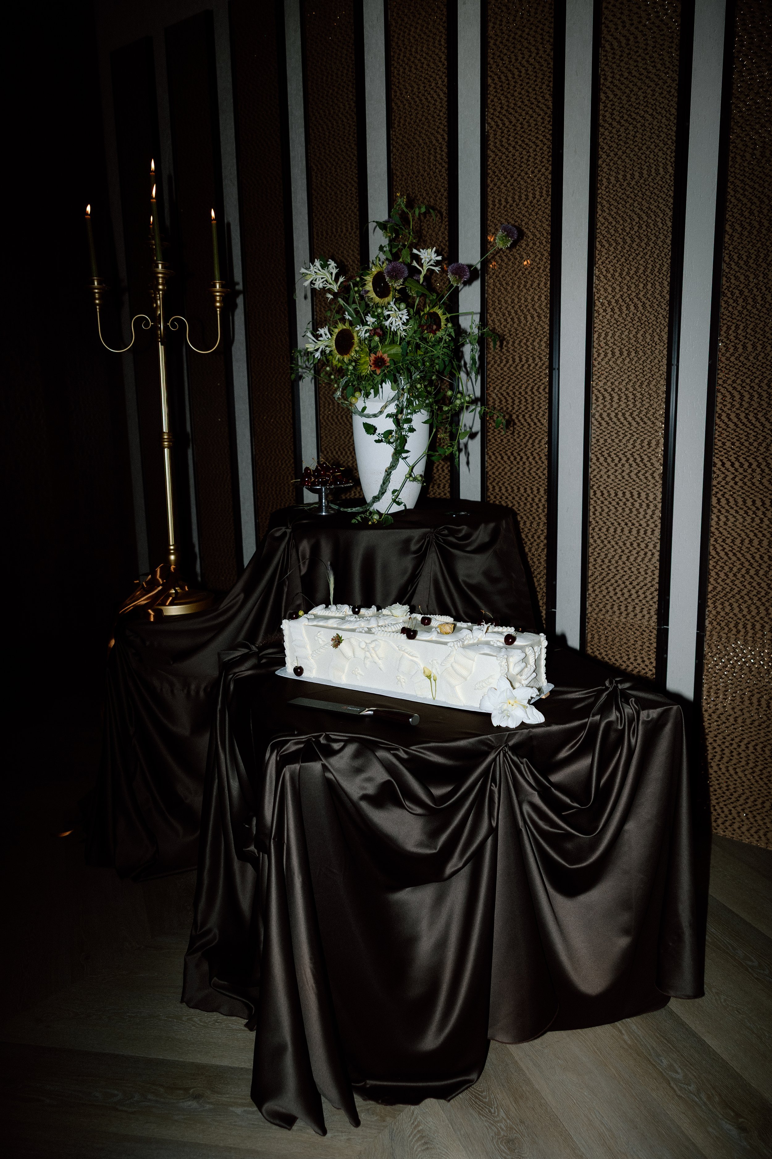
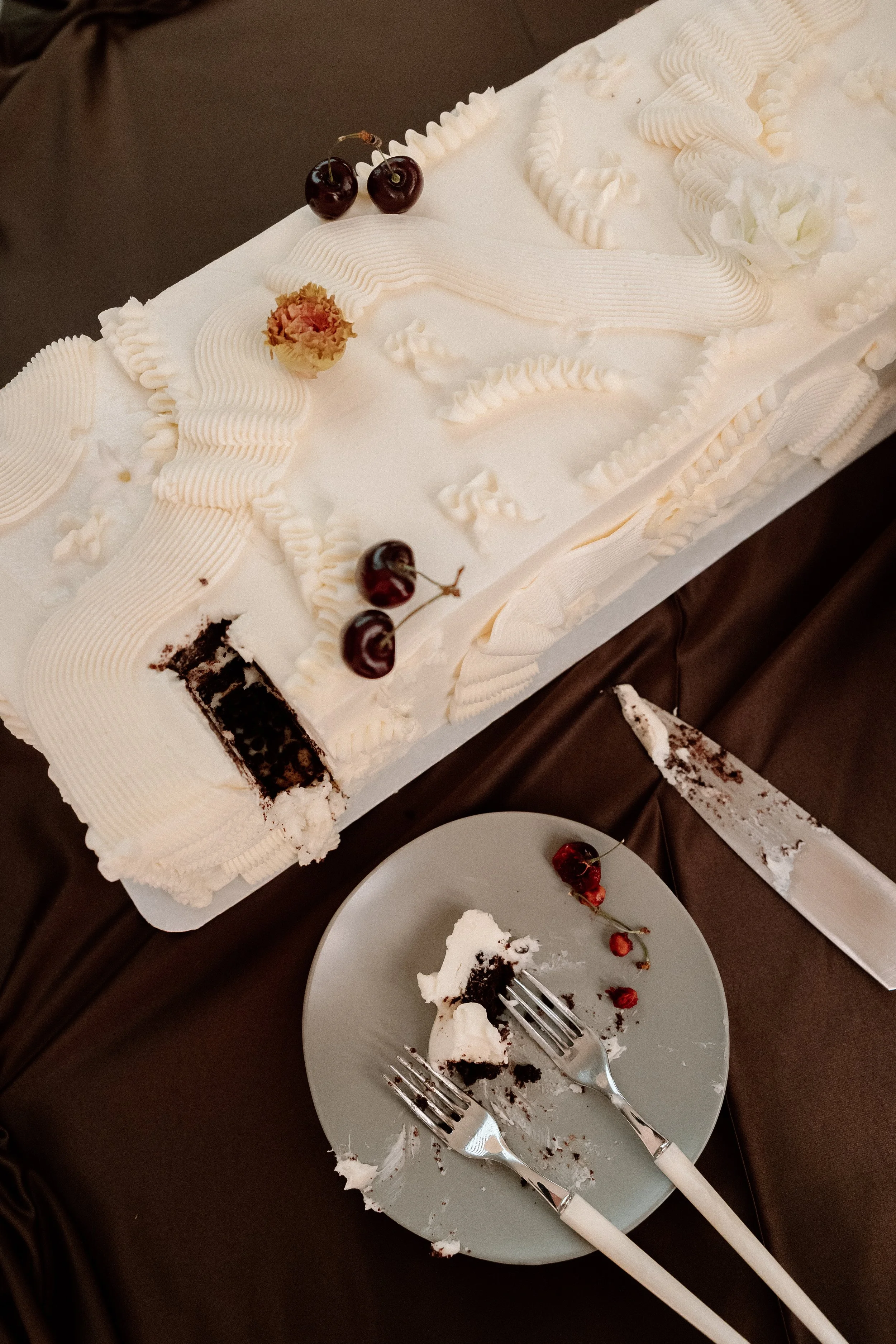
Cake: Kathy and Company
Content Creation: Bella Luna BTS
Event Sales Manager: Jayme Butcher
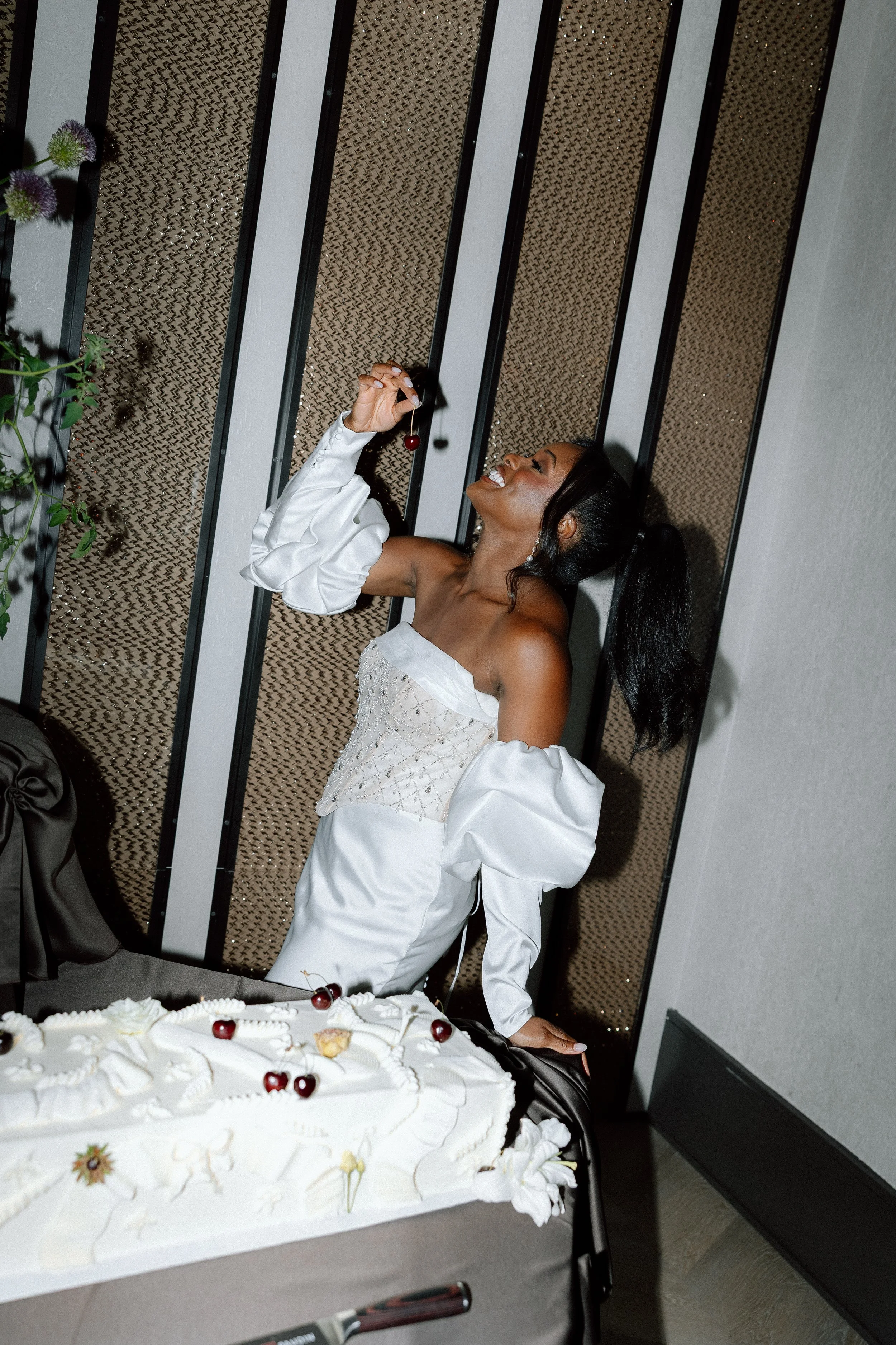
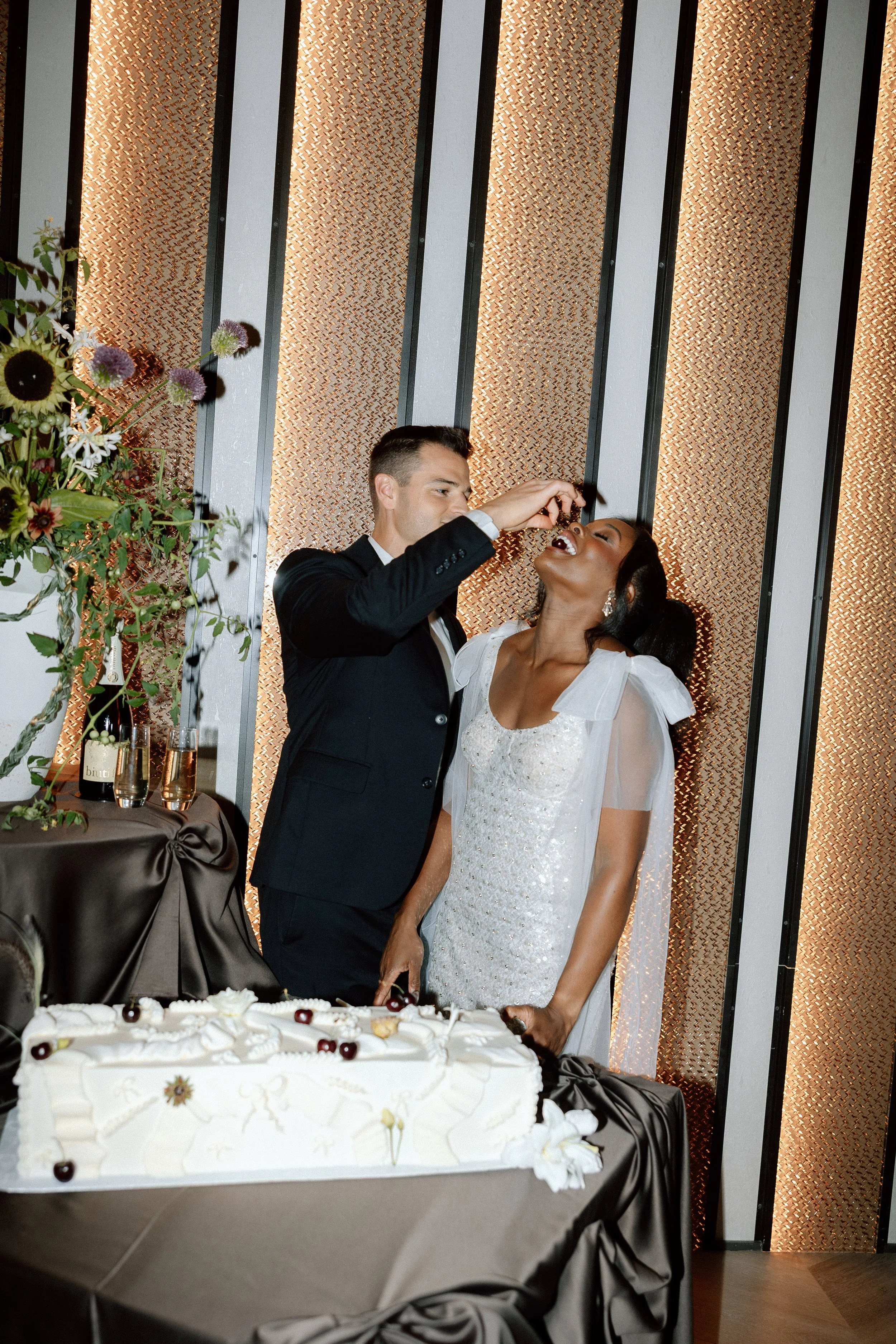
Bridal Gowns: Love Me Some Lace Bridal
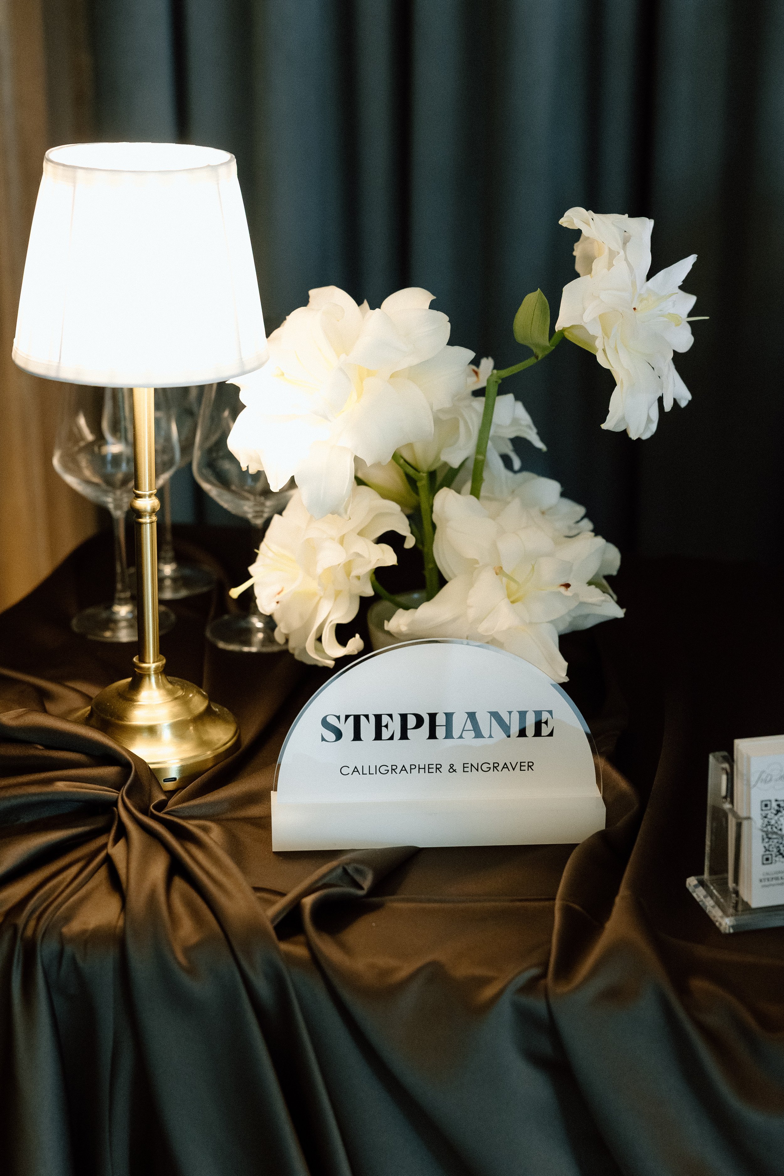
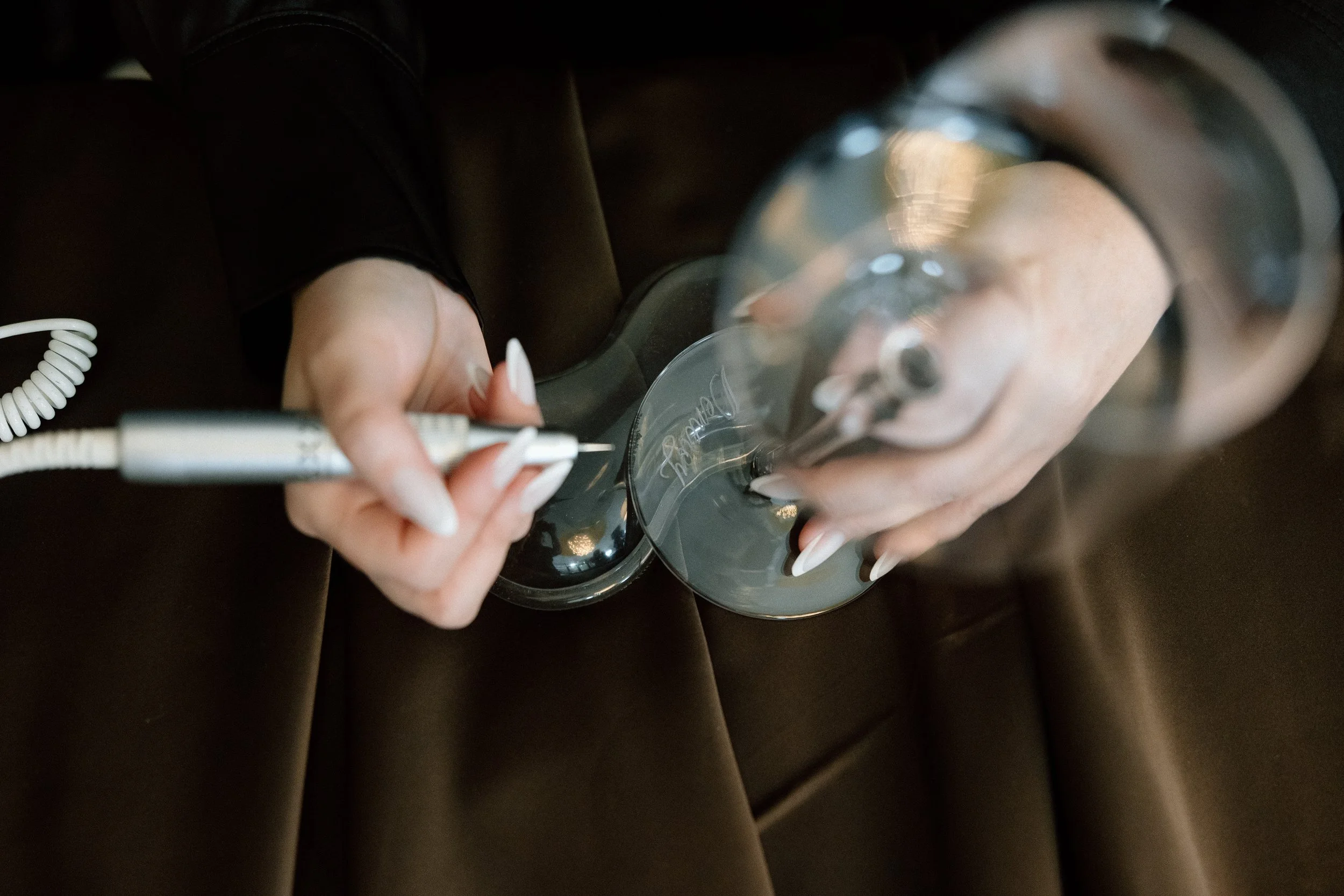
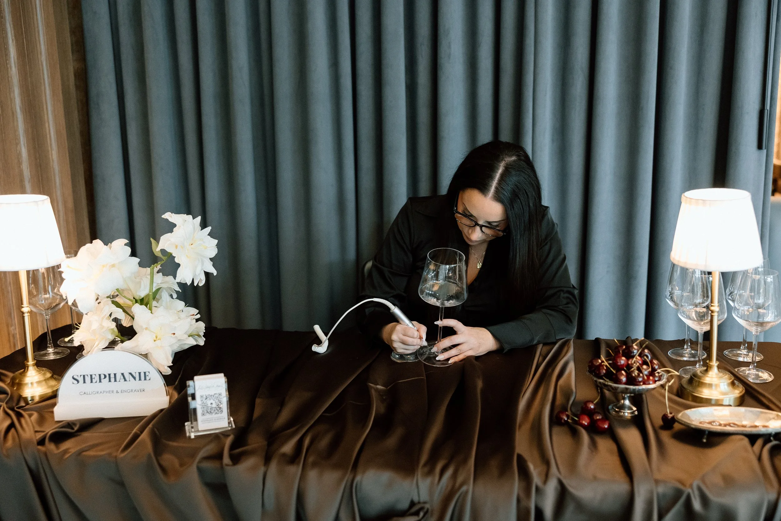
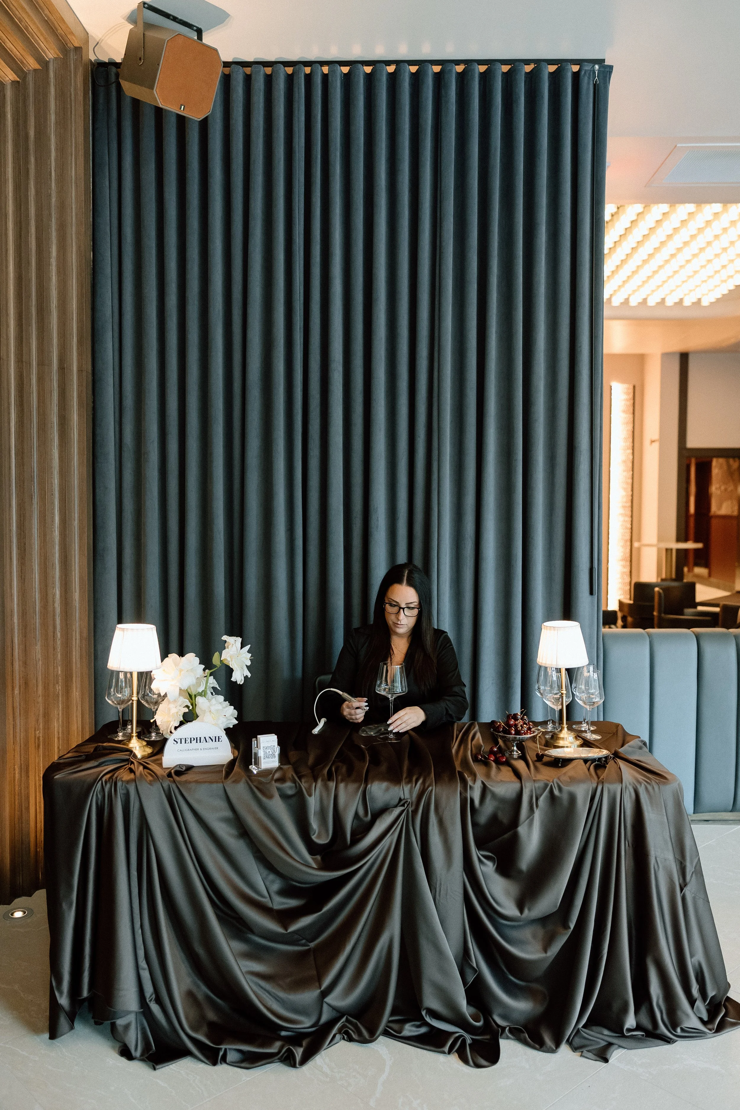
Calligraphy: Lettered by Steph
Welcome Sign: Fox and Adorn GVL
Rentals: Professional Party Rentals
Saxophone: Steven Galloway
Band: JD Ross Music & Riss
Models: Cory & Cookey Lopes
Katelyn & Nate Zakariasen
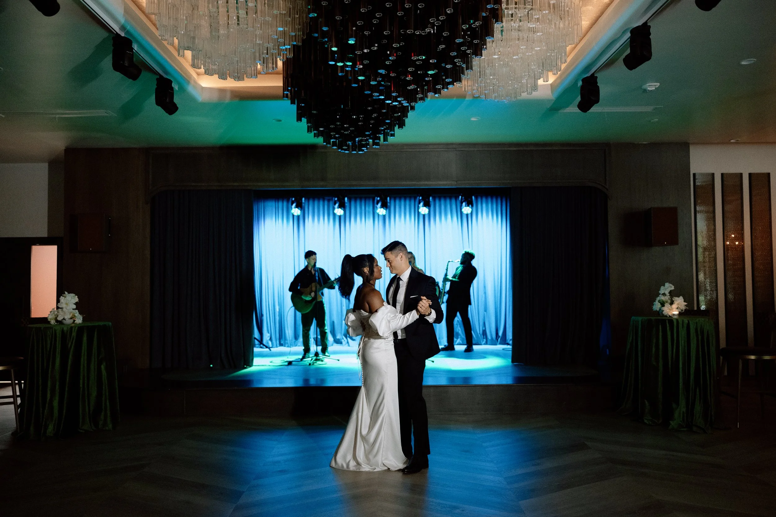
Moody Wedding Inspiration at Seratonic
A Jazz Lounge Styled Shoot
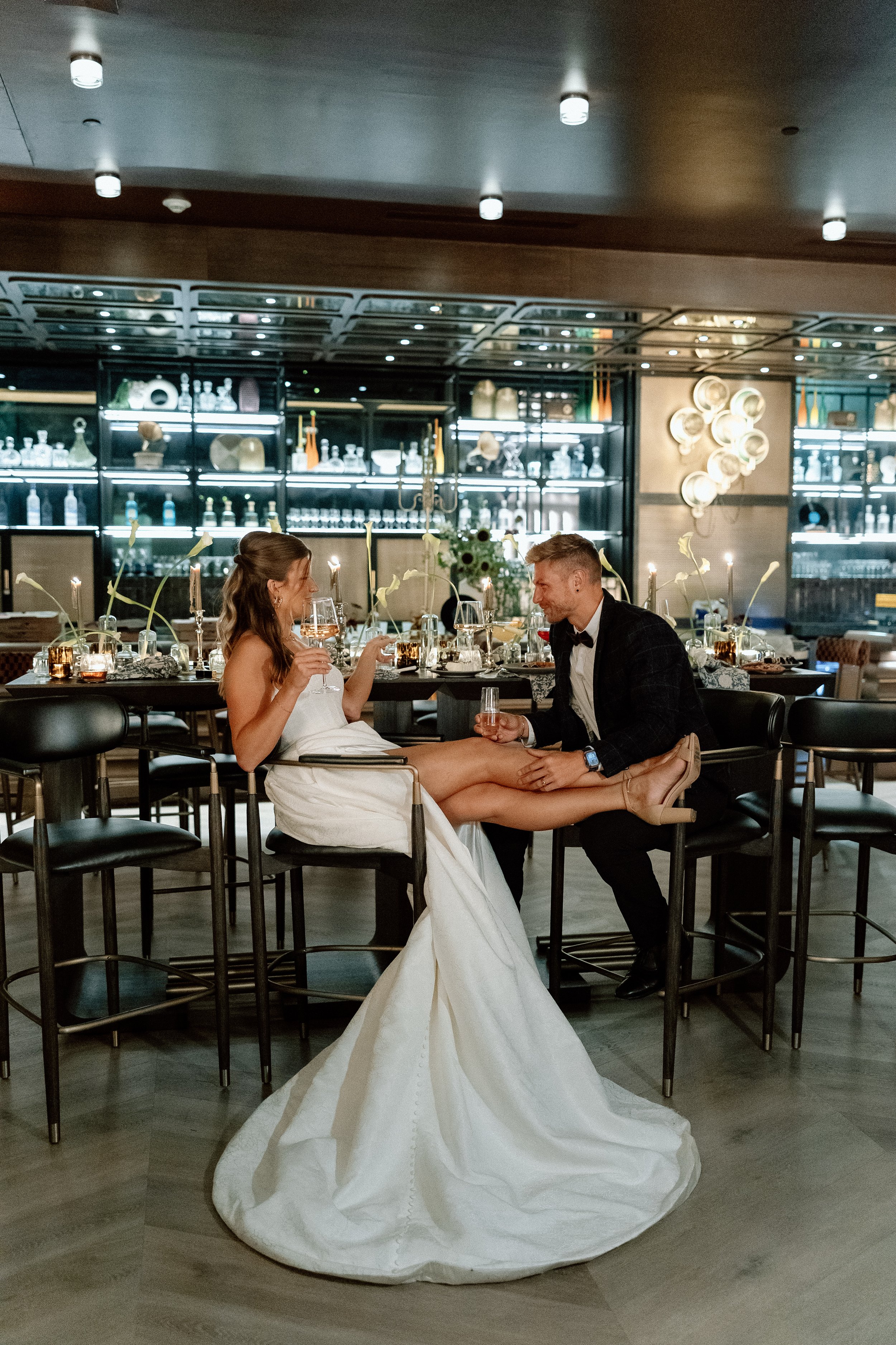
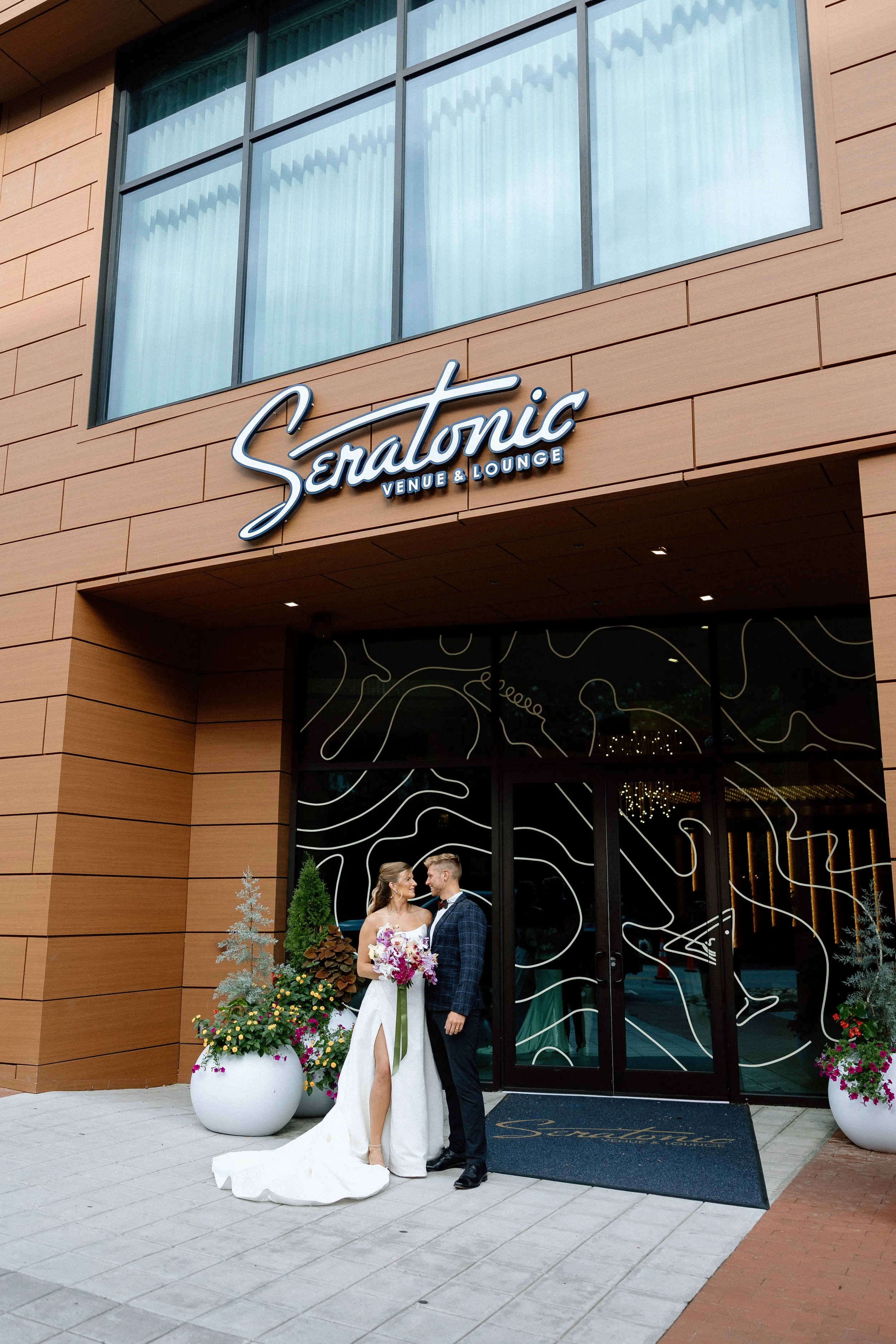
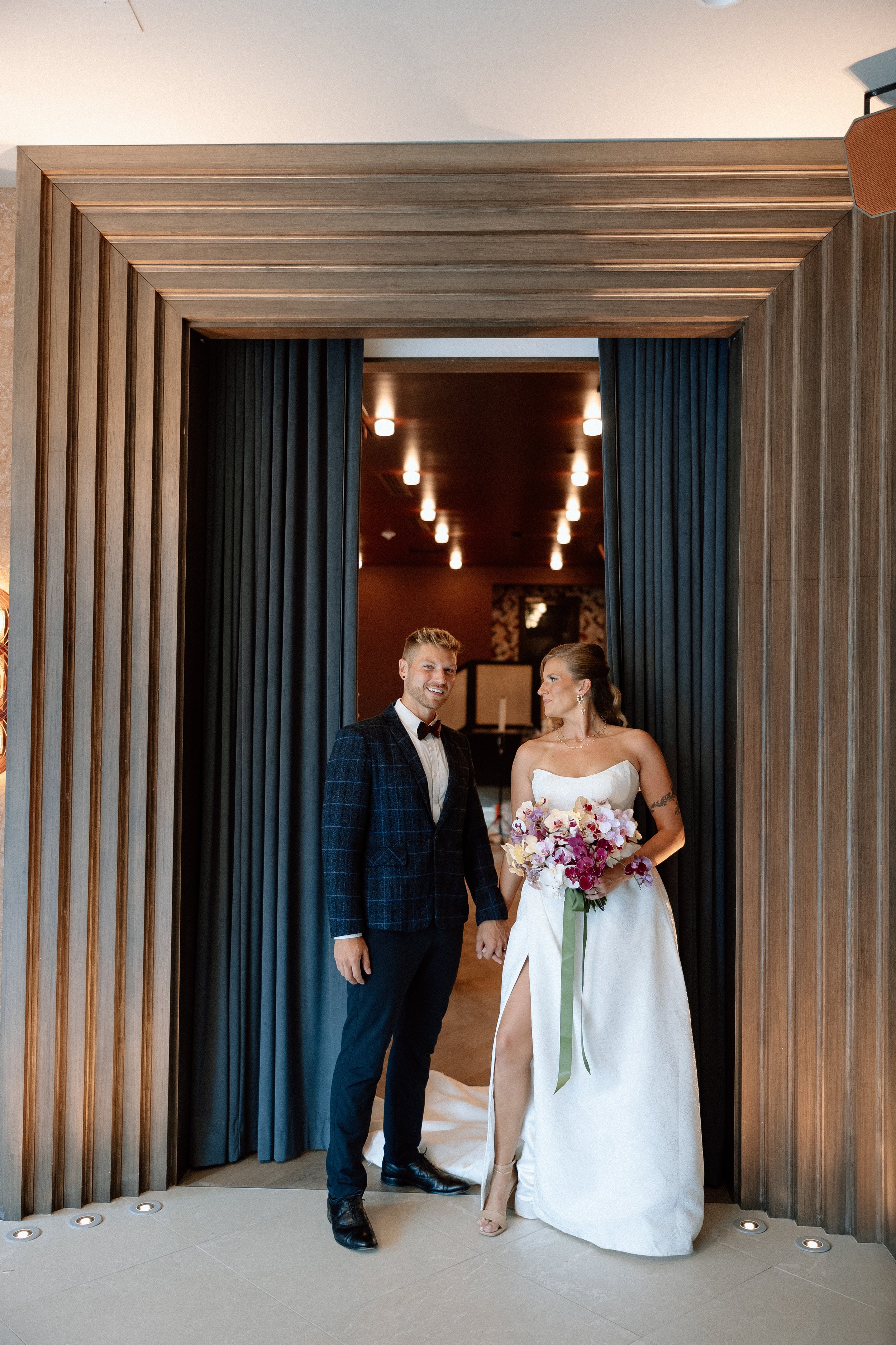
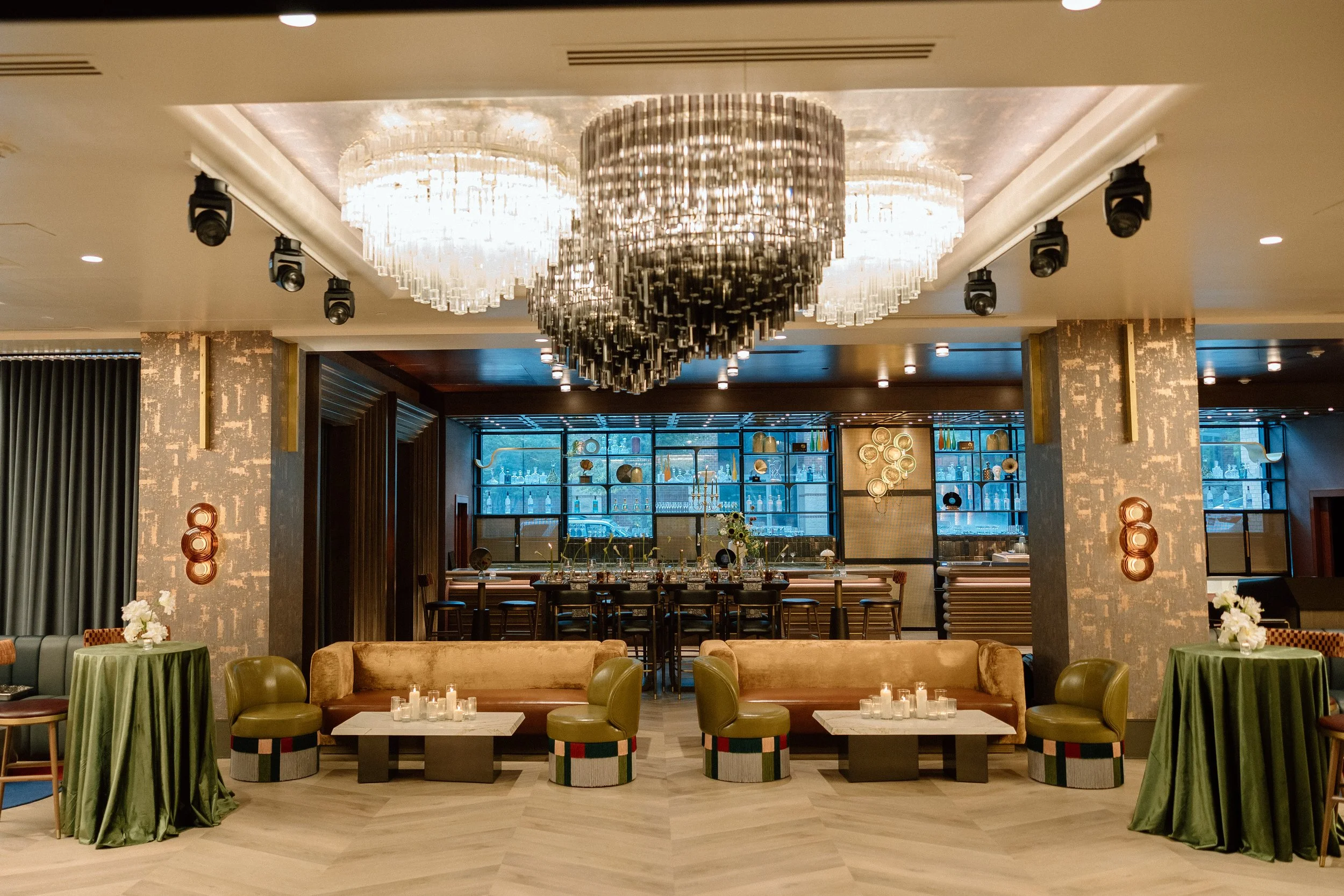
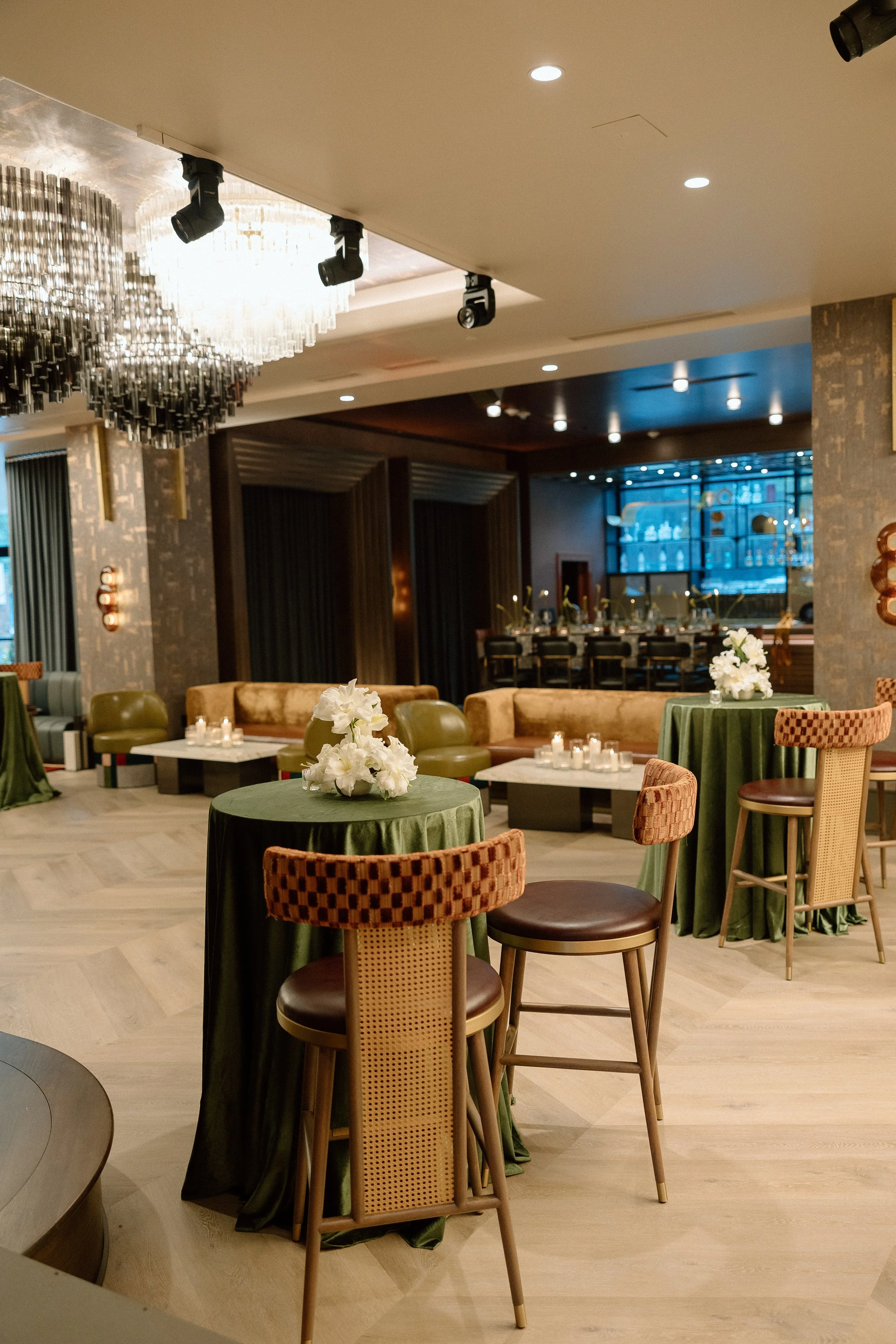
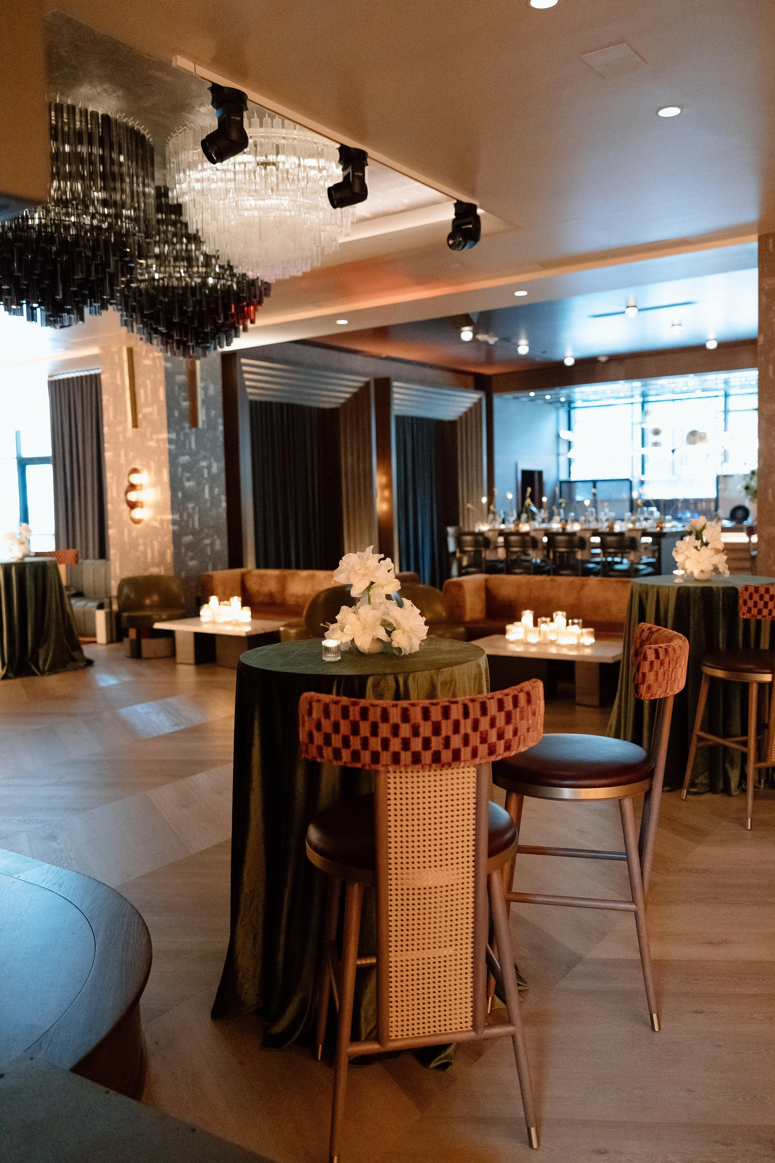
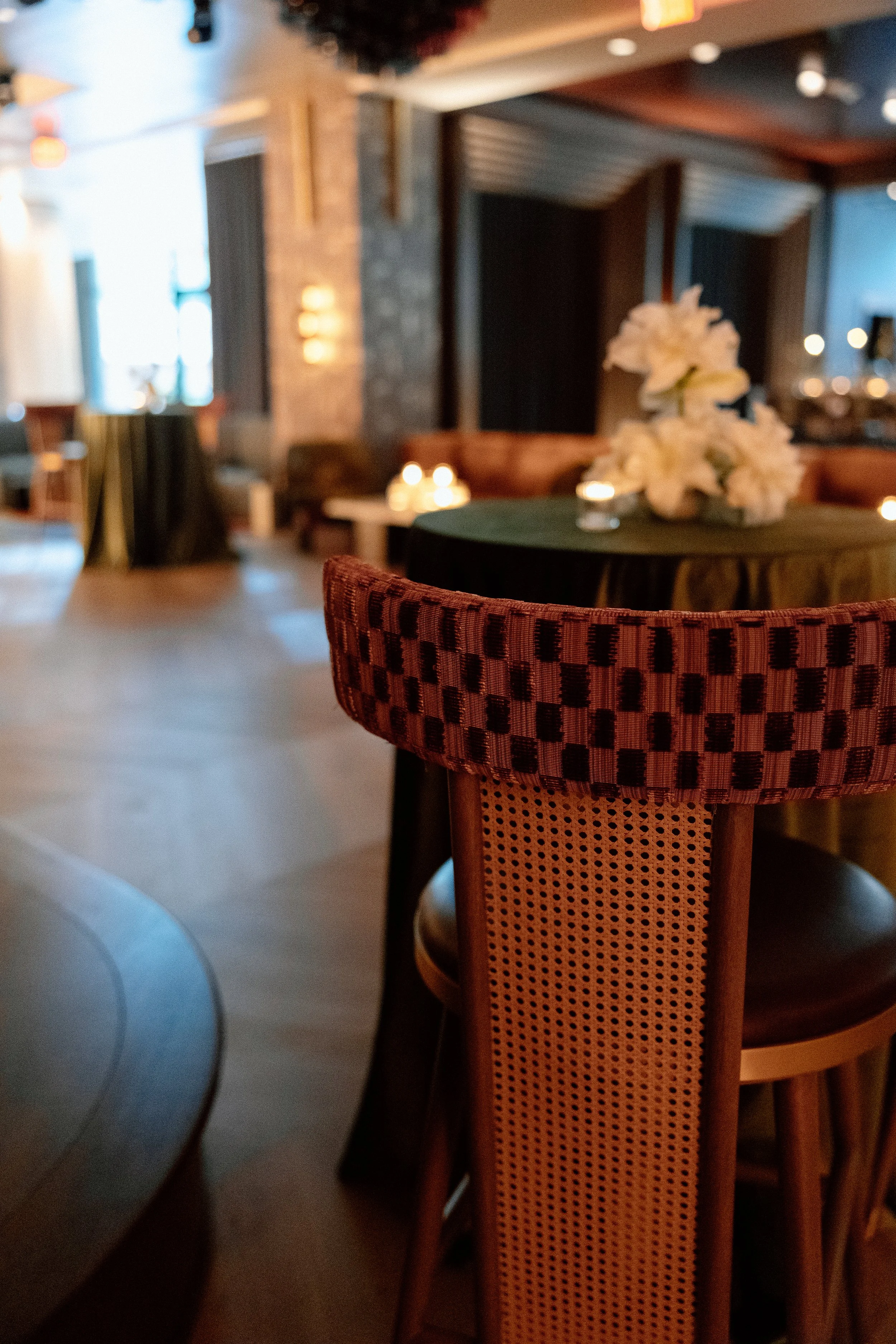
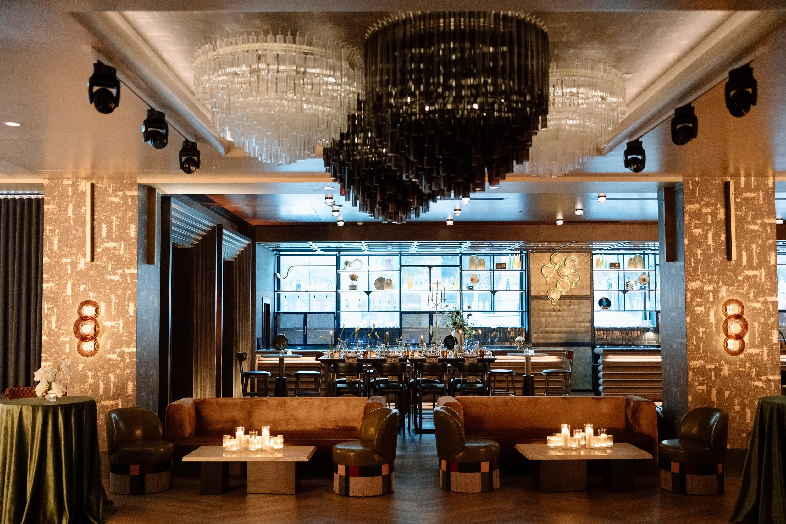
Tucked inside the AC Hotel in the heart of Downtown Greenville, South Carolina, Seratonic is a jazz lounge-inspired venue unlike anything else in the Upstate. With its moody lighting, plush textiles, and sculptural architecture, Seratonic is made for the modern bride drawn to spaces that are both artistic and atmospheric.
Our team at Rachel Deneroy Designs curated the full creative direction and floral styling for this editorial shoot. Every detail—from the color story to the layered textures—was designed to honor the depth and drama of the space while offering inspiration for couples who want their wedding to feel intentional, elevated, and unforgettable.


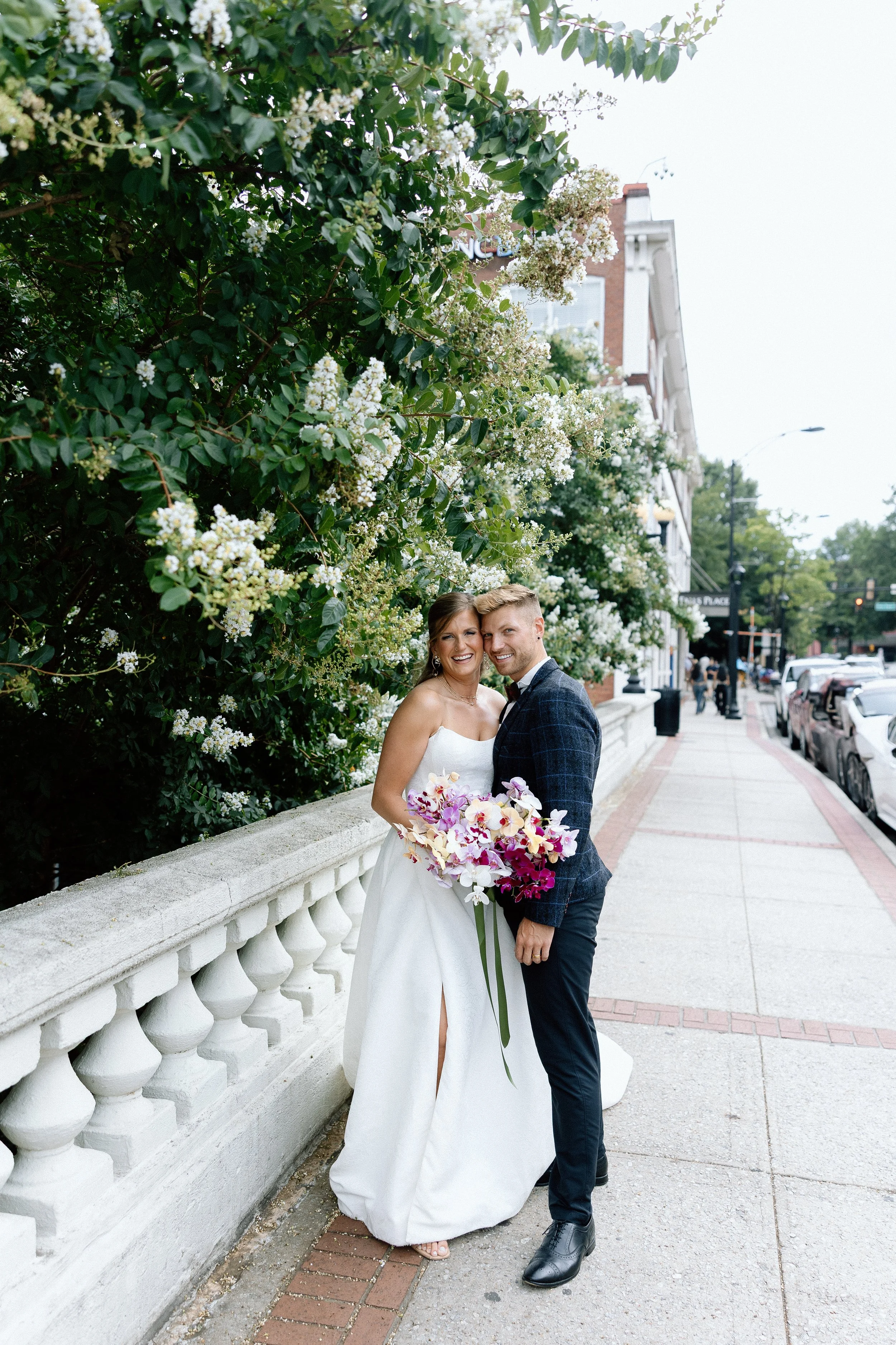
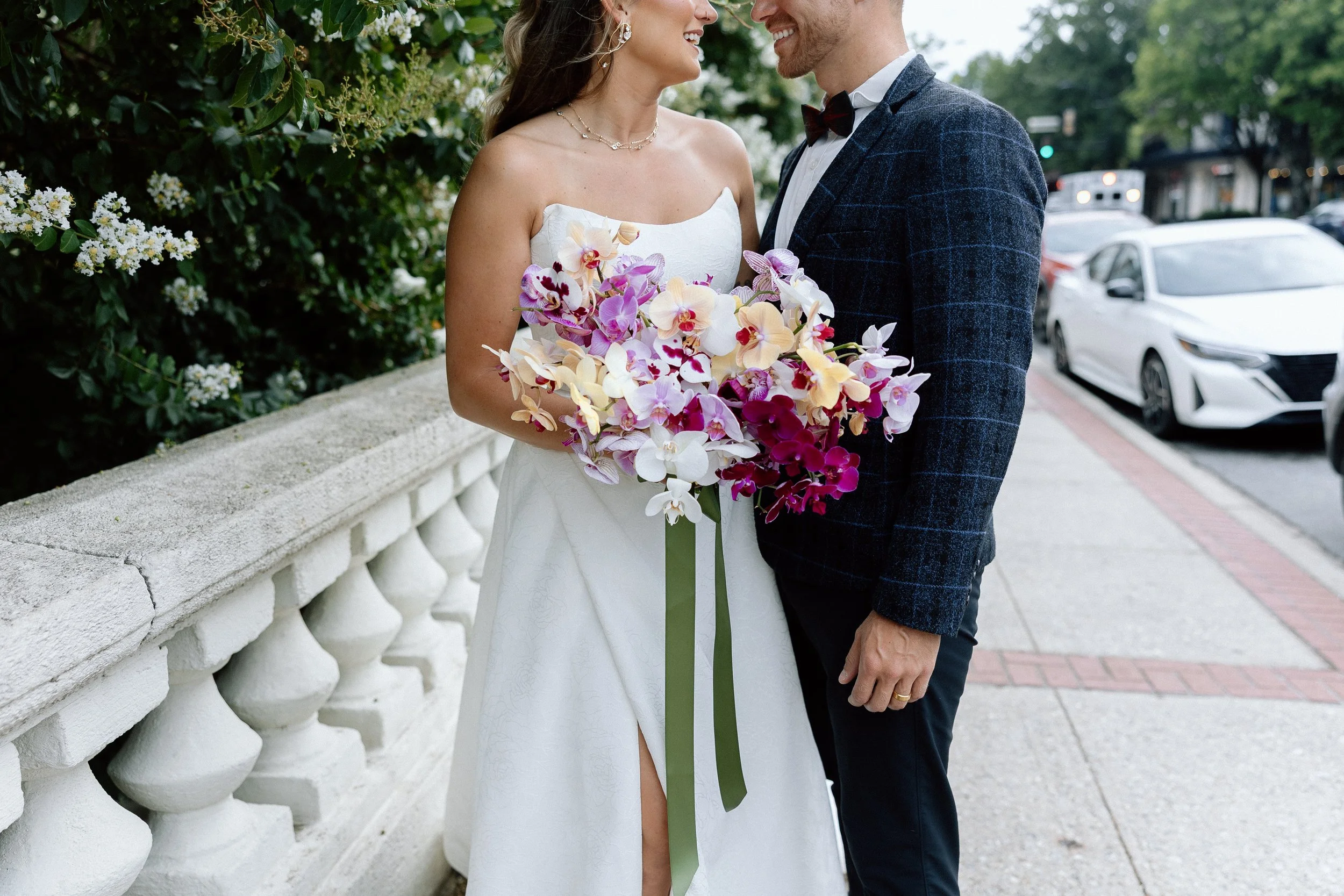
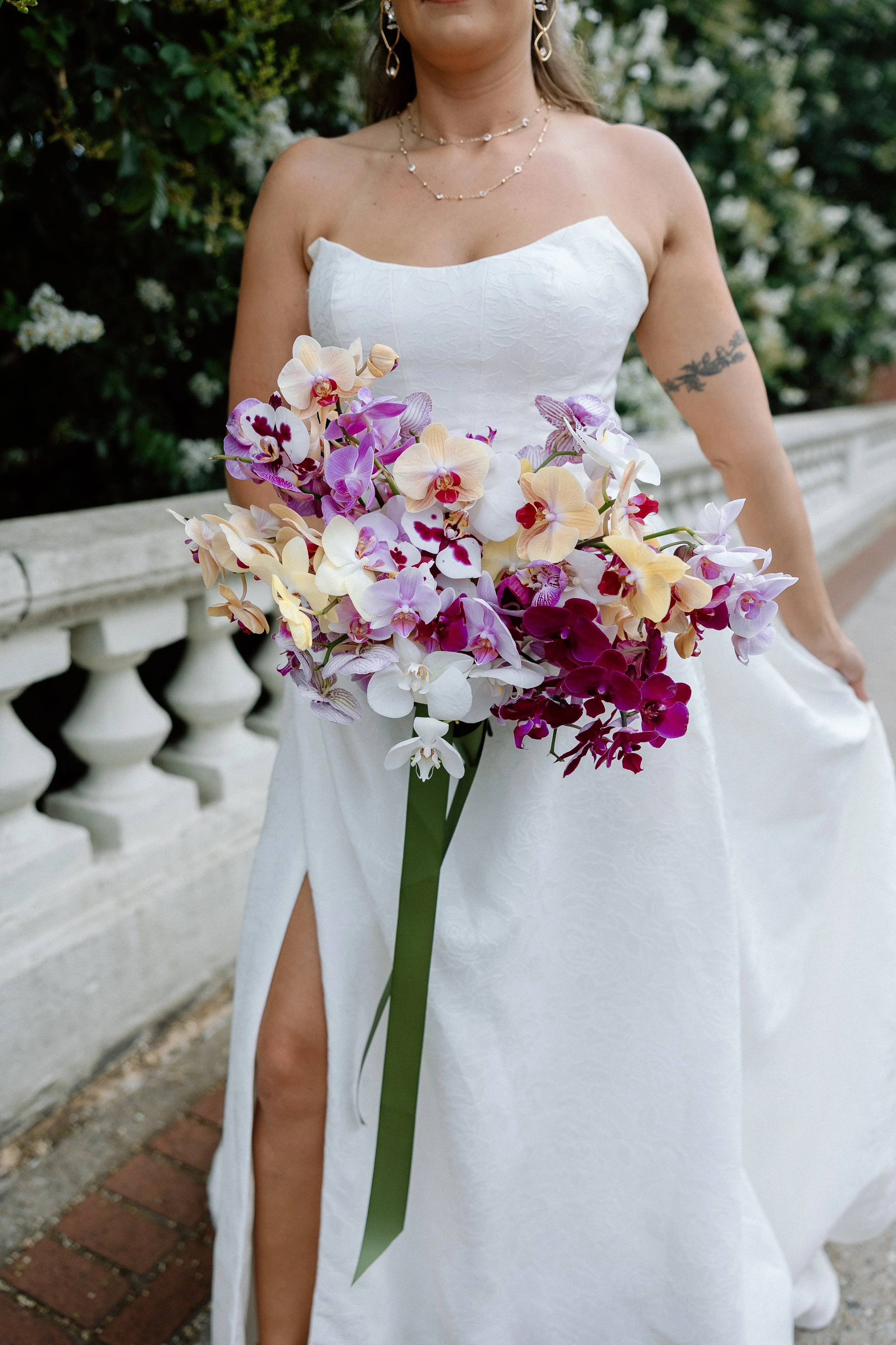
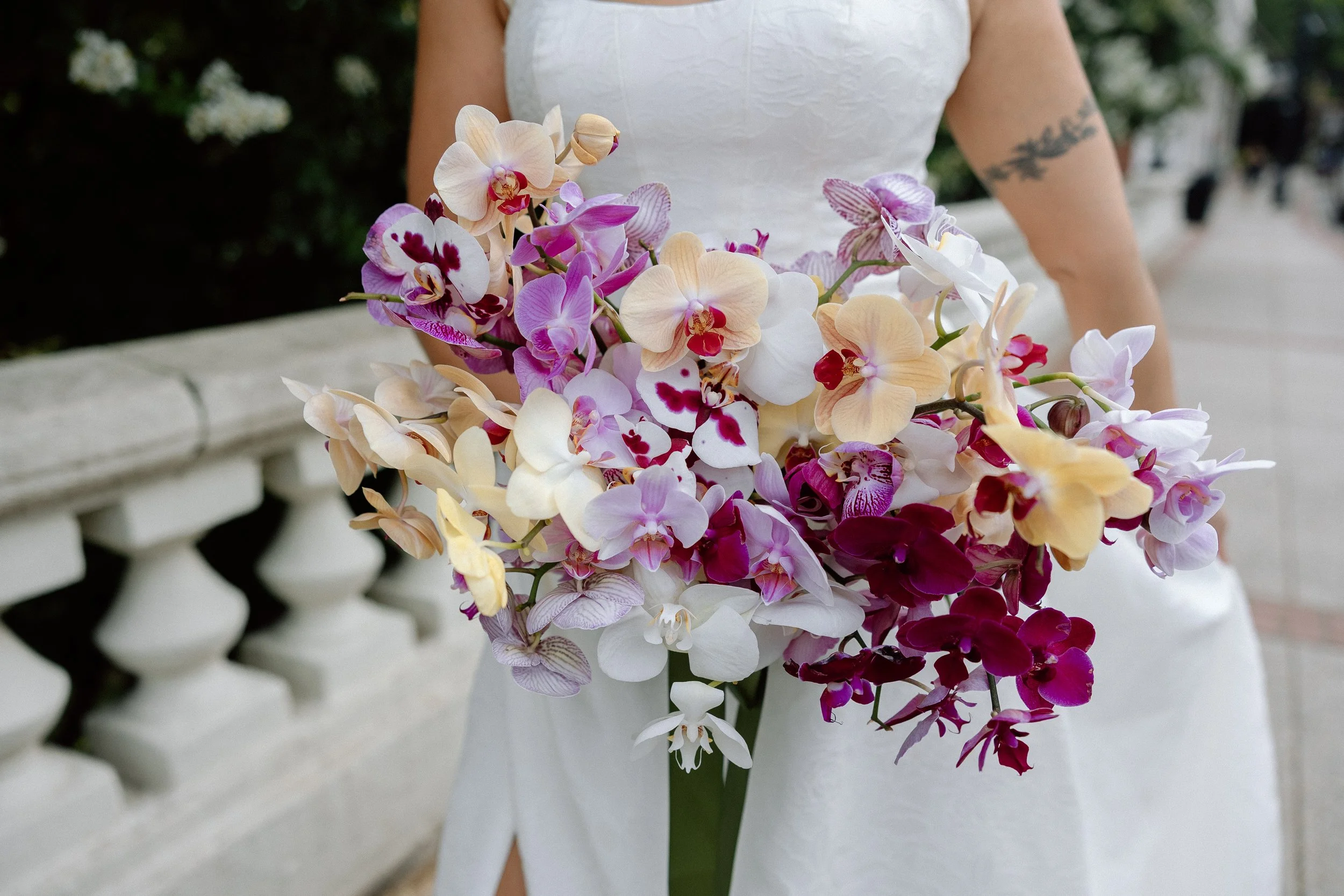
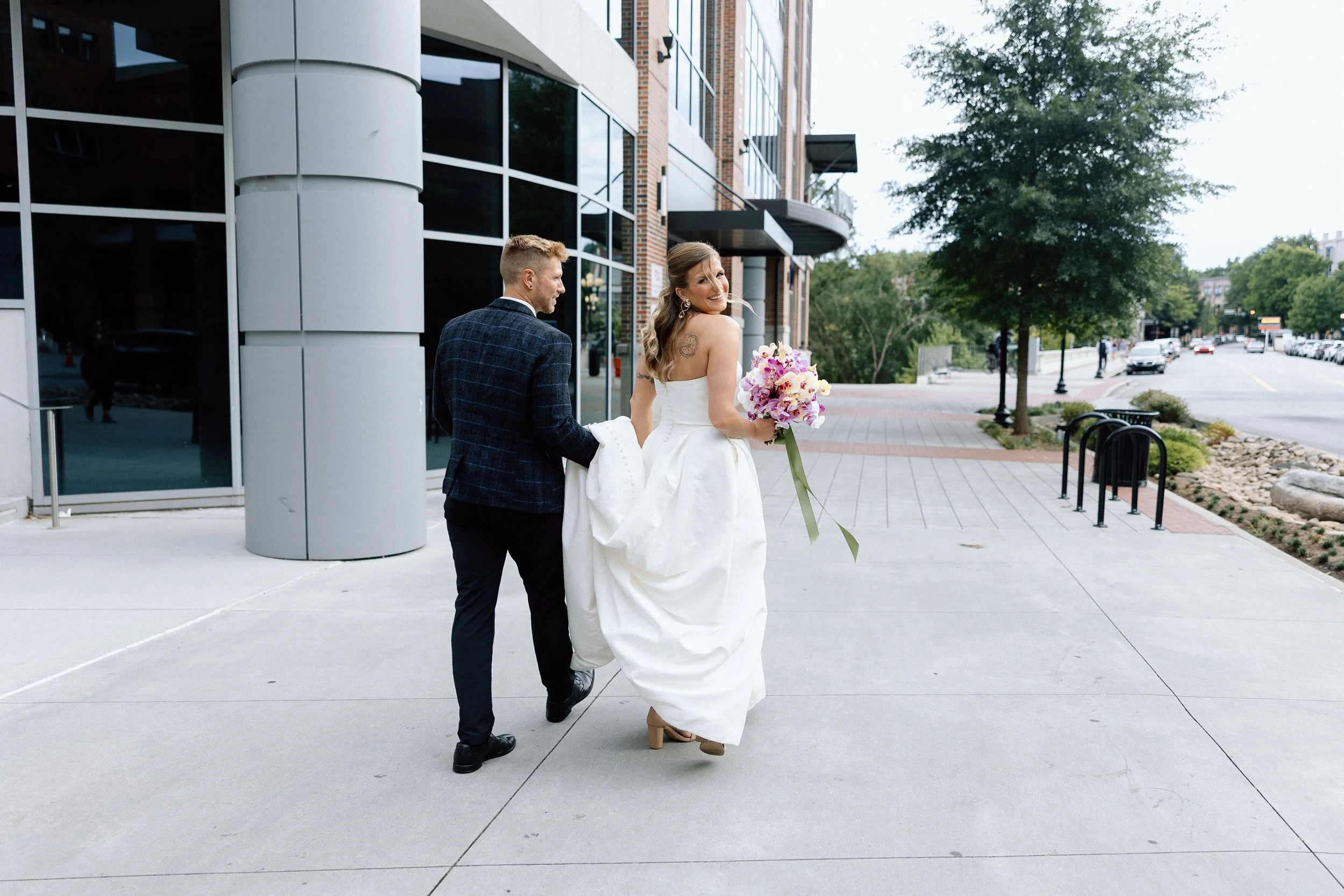
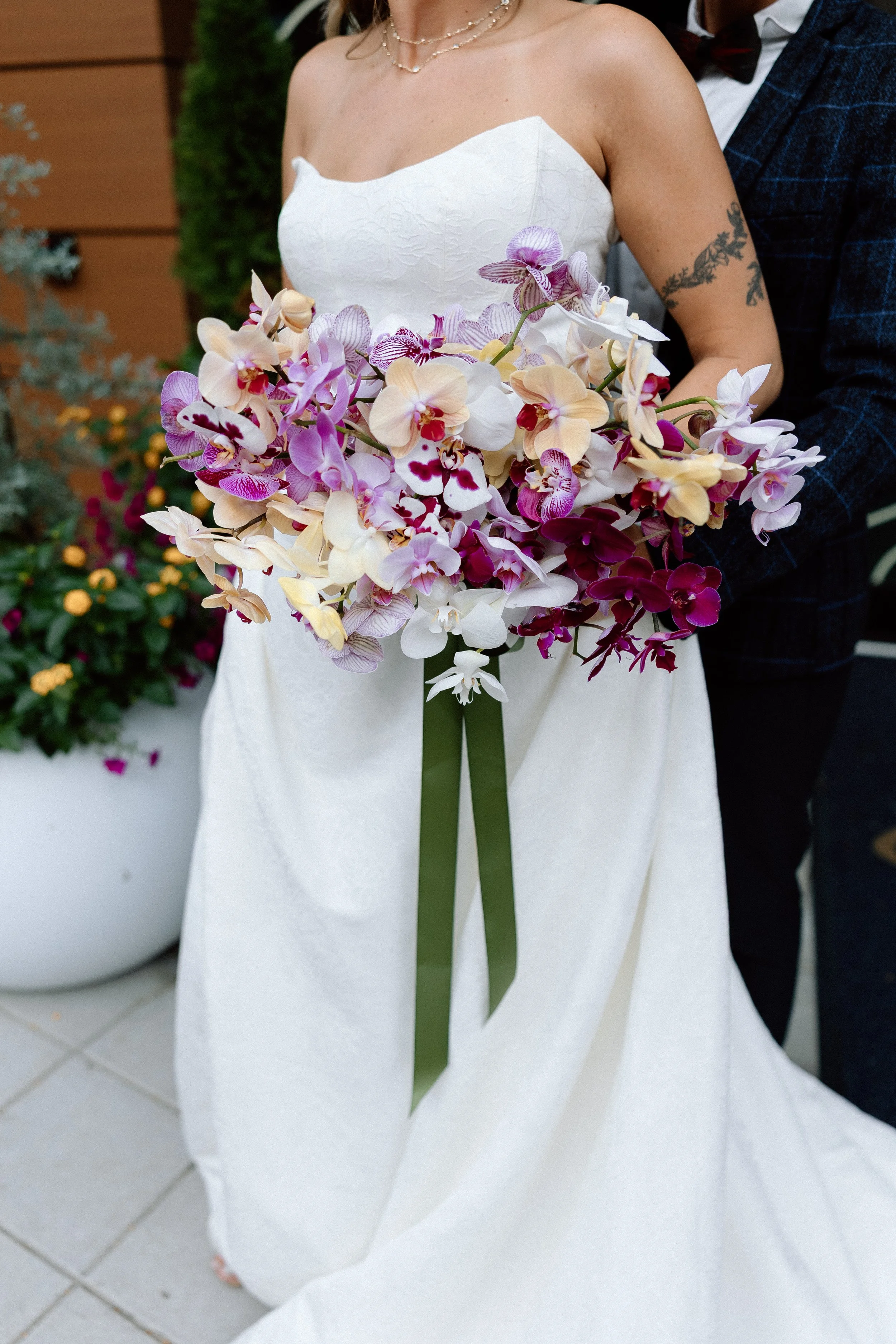
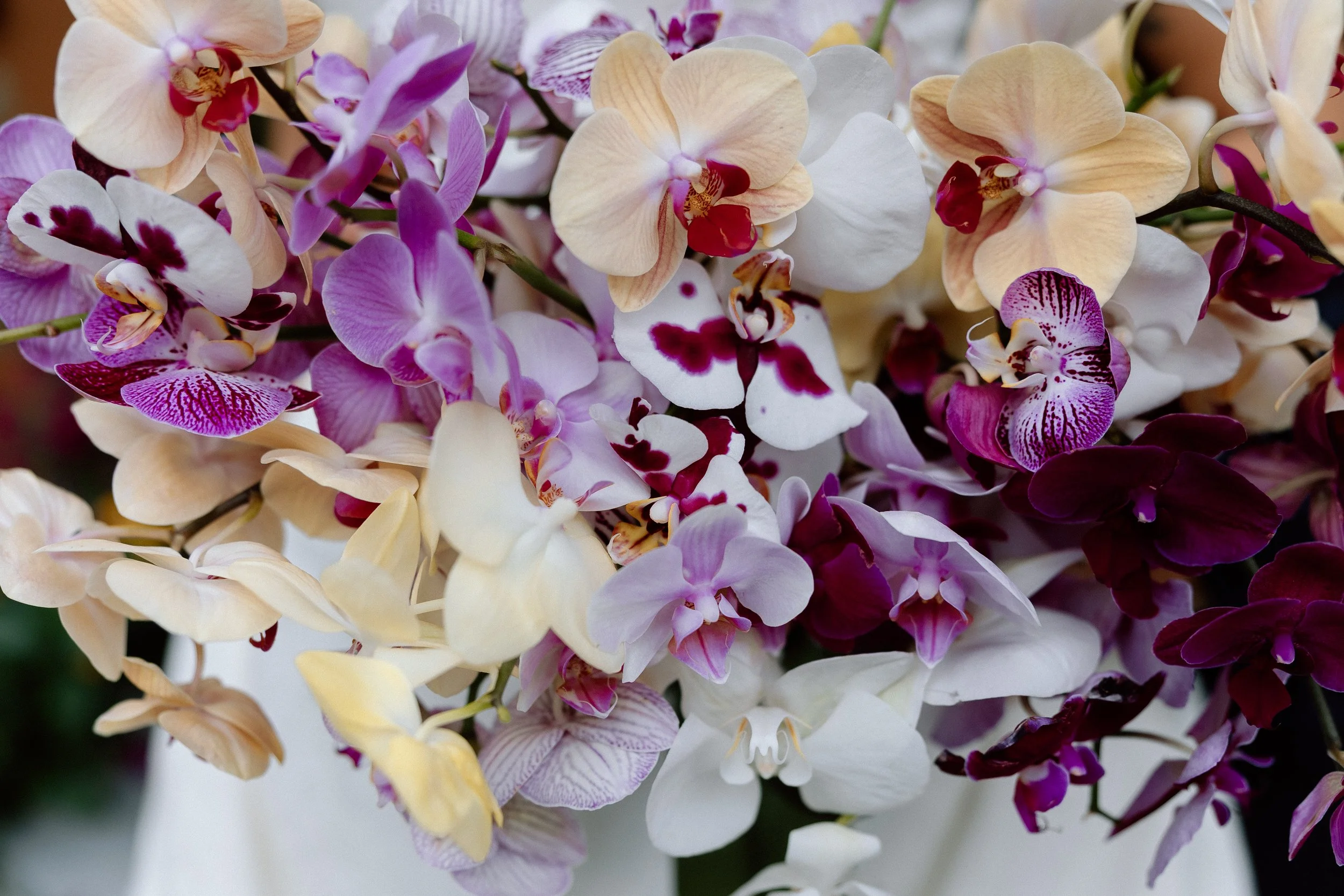
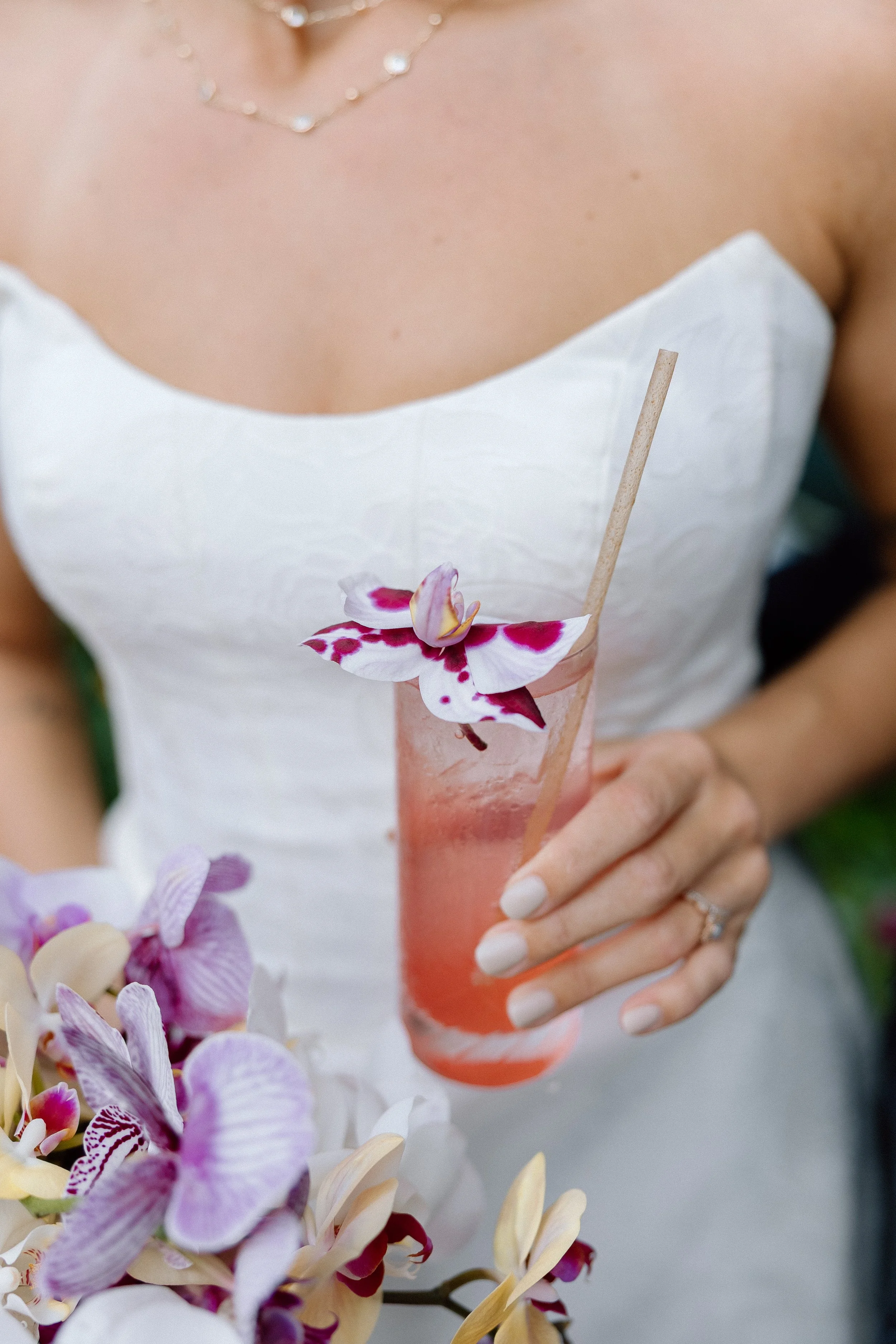
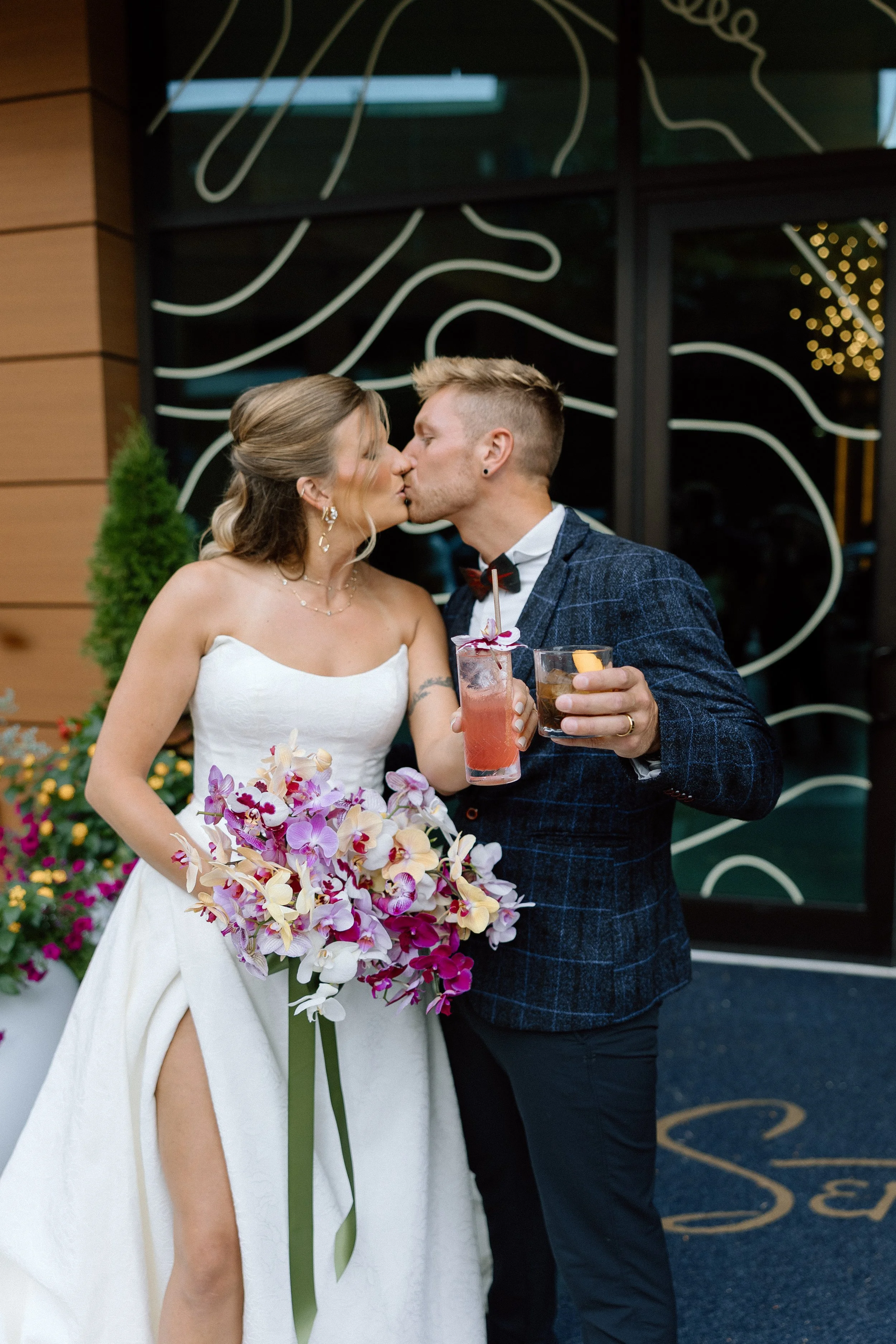
The first bridal bouquet was an unexpected standout: a mono-bloom bouquet of saturated wine-colored orchids, designed as a bold, sculptural moment against an otherwise neutral-toned design. The florals moved with elegance and restraint—lush yet deliberate, just like the venue itself.


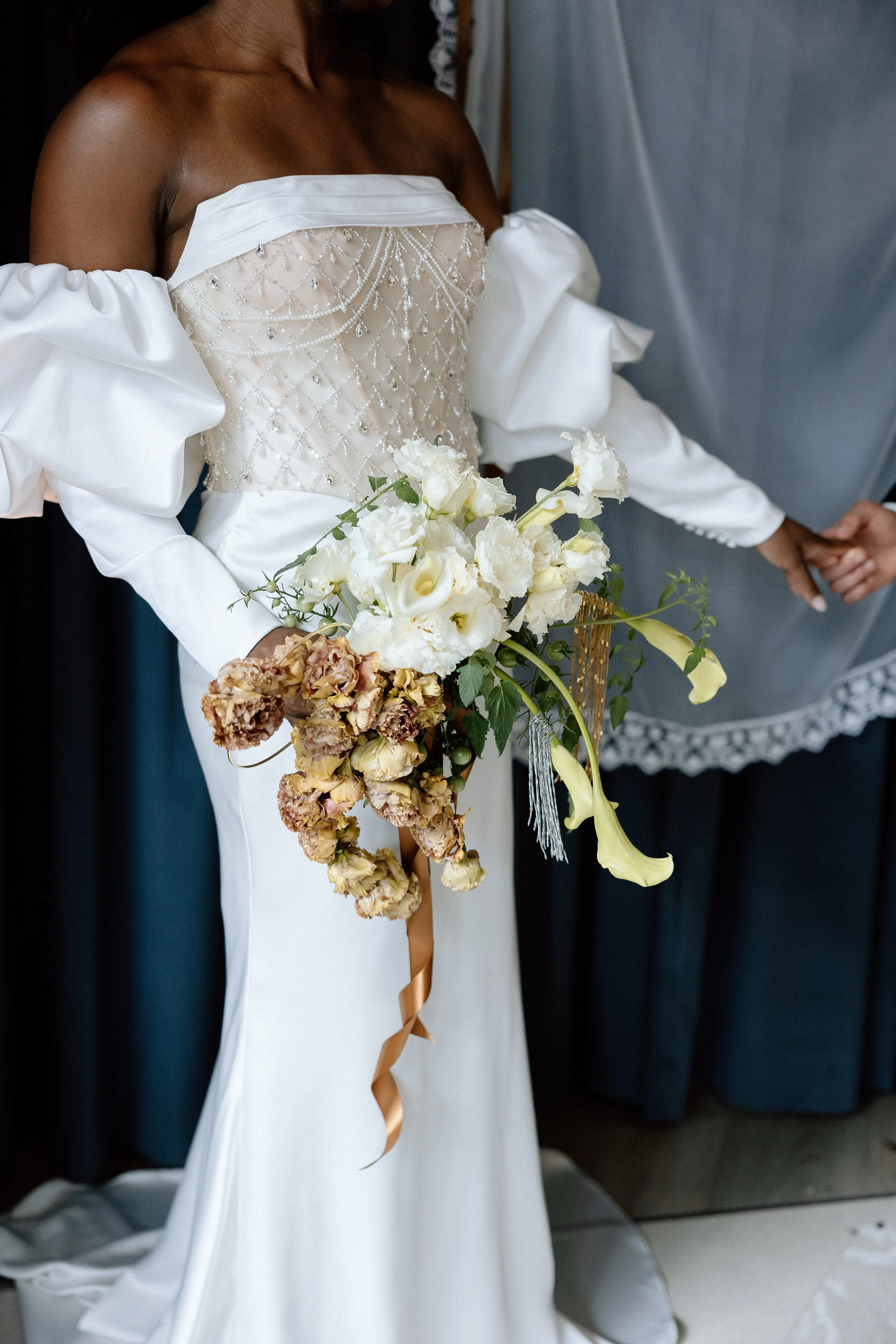
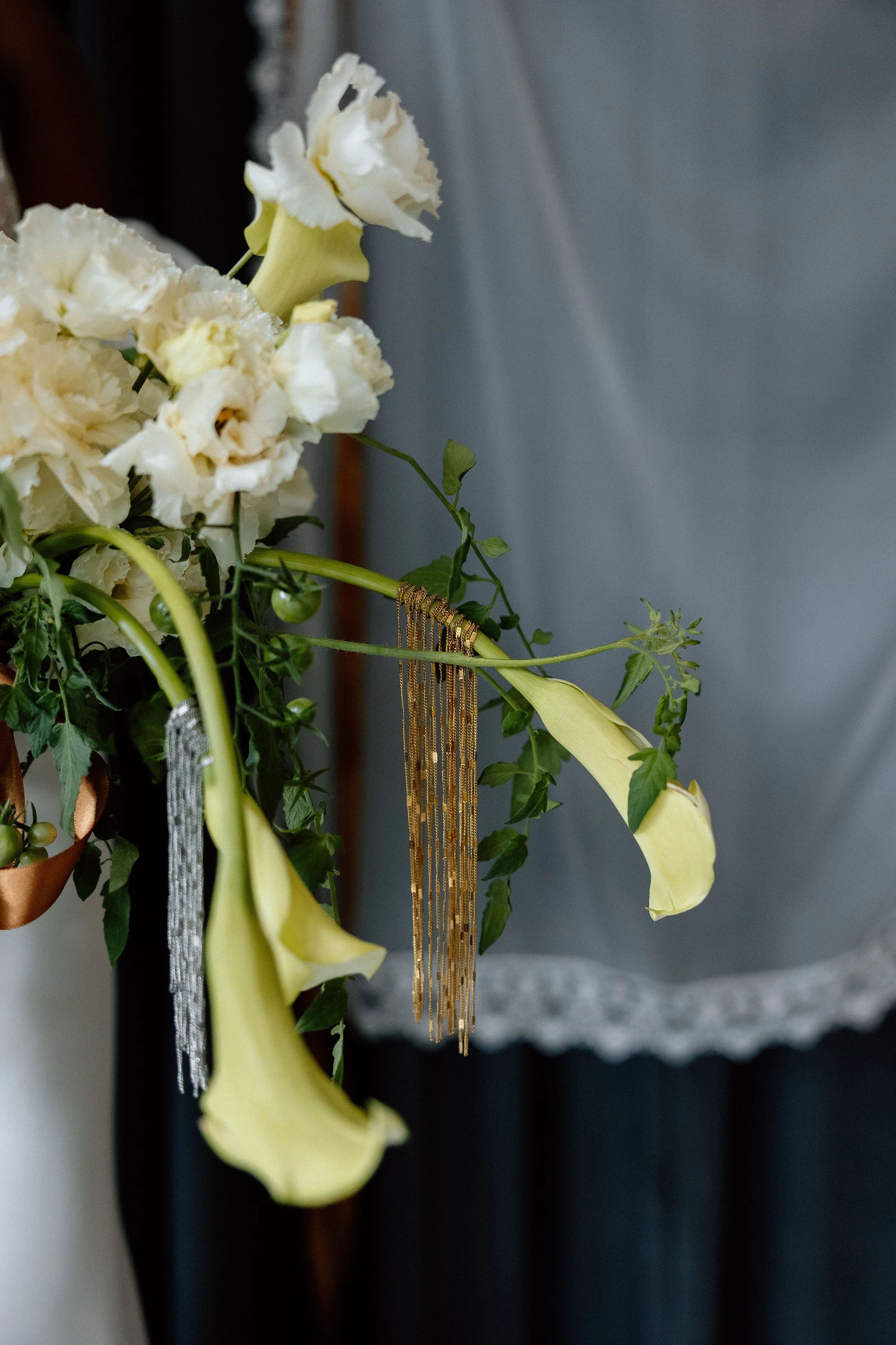
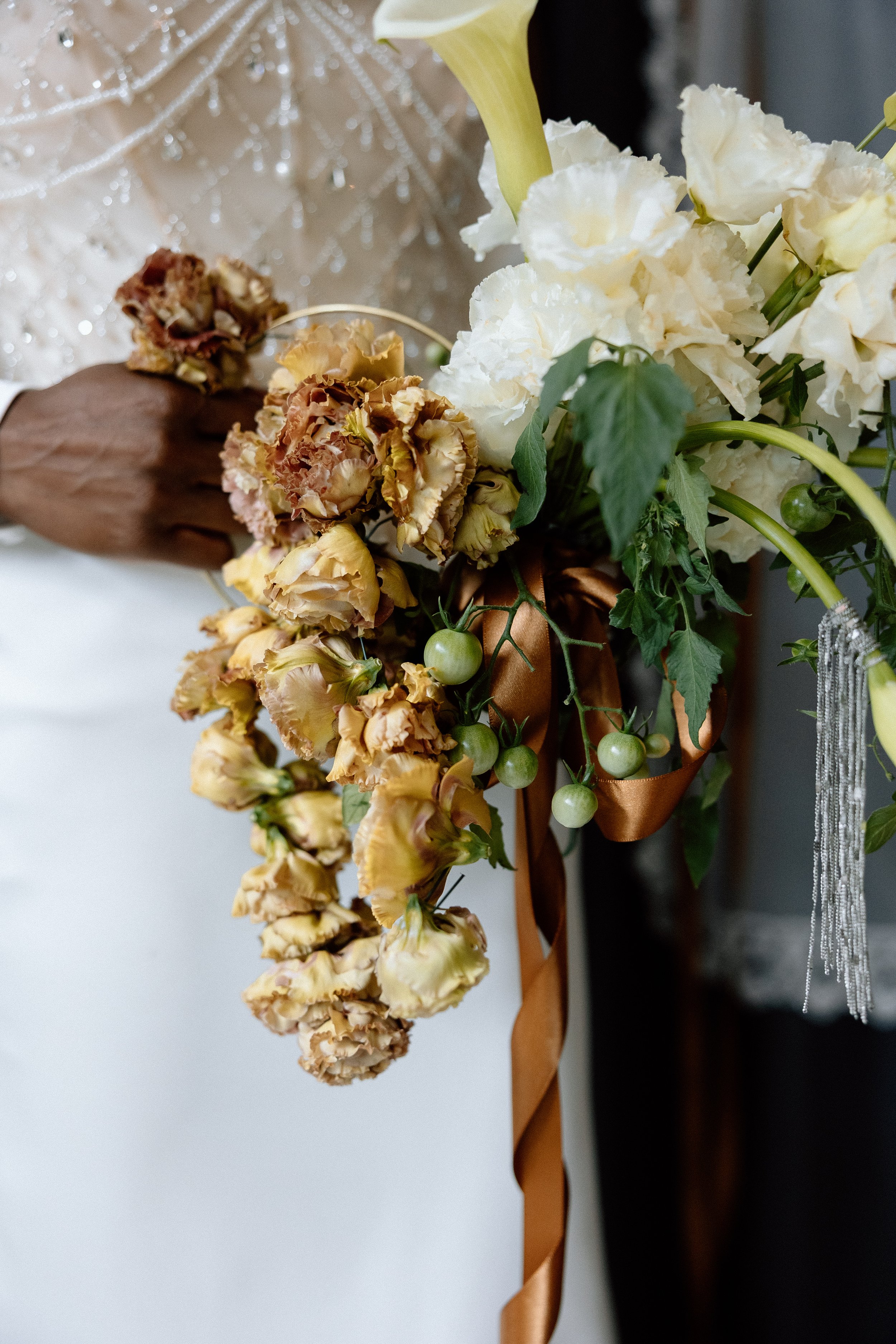
The second bridal bouquet was our take on the emerging purse bouquet trend. Crafted with a structured handle, it was designed to be carried like a handbag—fashion-forward yet floral-focused. We strung locally grown brown lisianthus, chosen for its flexibility and ability to be twisted into unique, sculptural forms. To further echo the venue’s aesthetic, we adorned the calla lilies with gold and silver chain accents, referencing the statement chain art installation in Seratonic’s entryway and the venue’s consistent use of mixed metals throughout. The result was a bouquet that felt modern, wearable, and deeply connected to the design language of the space.


A Floral Palette That Leaned Into the Mood
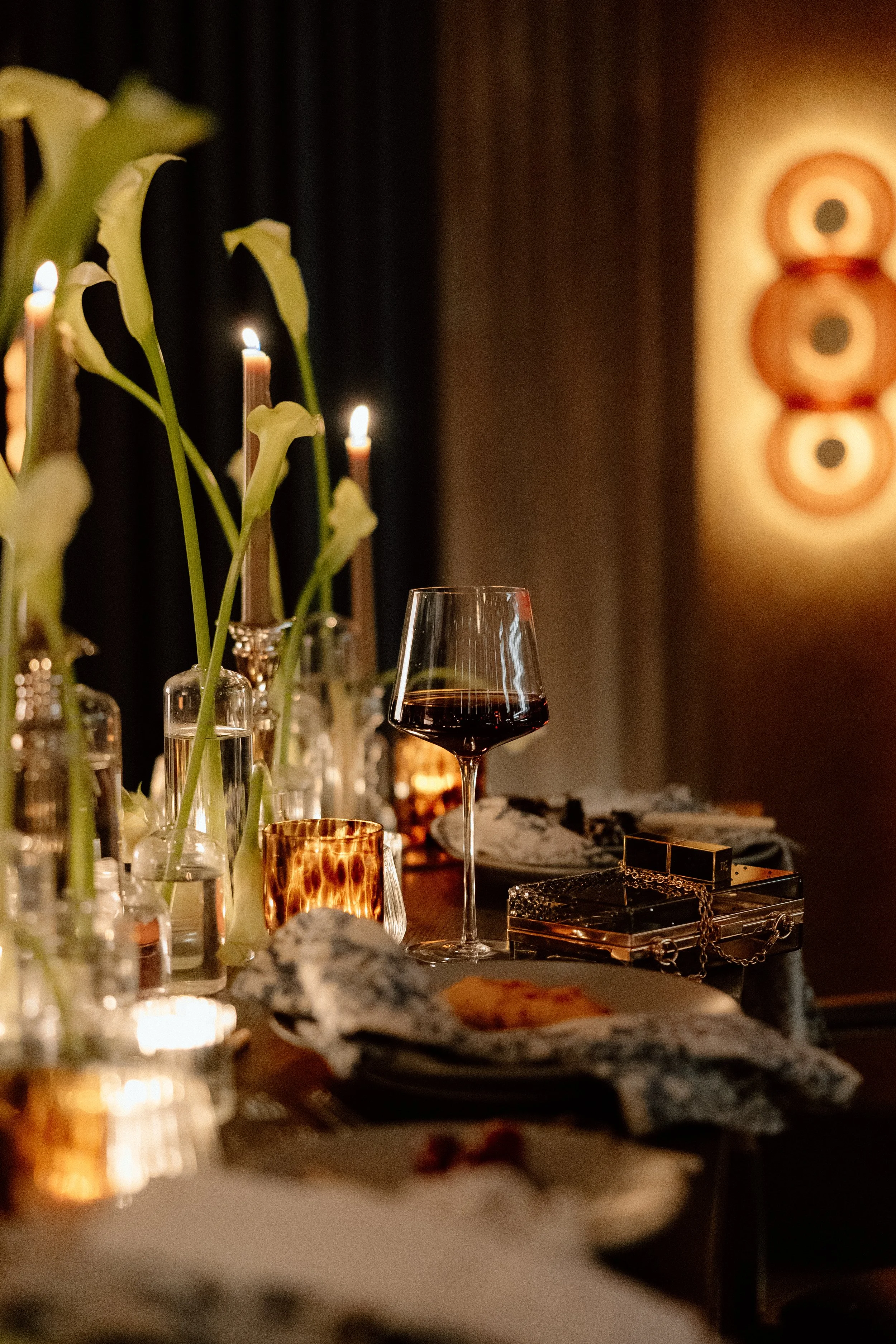
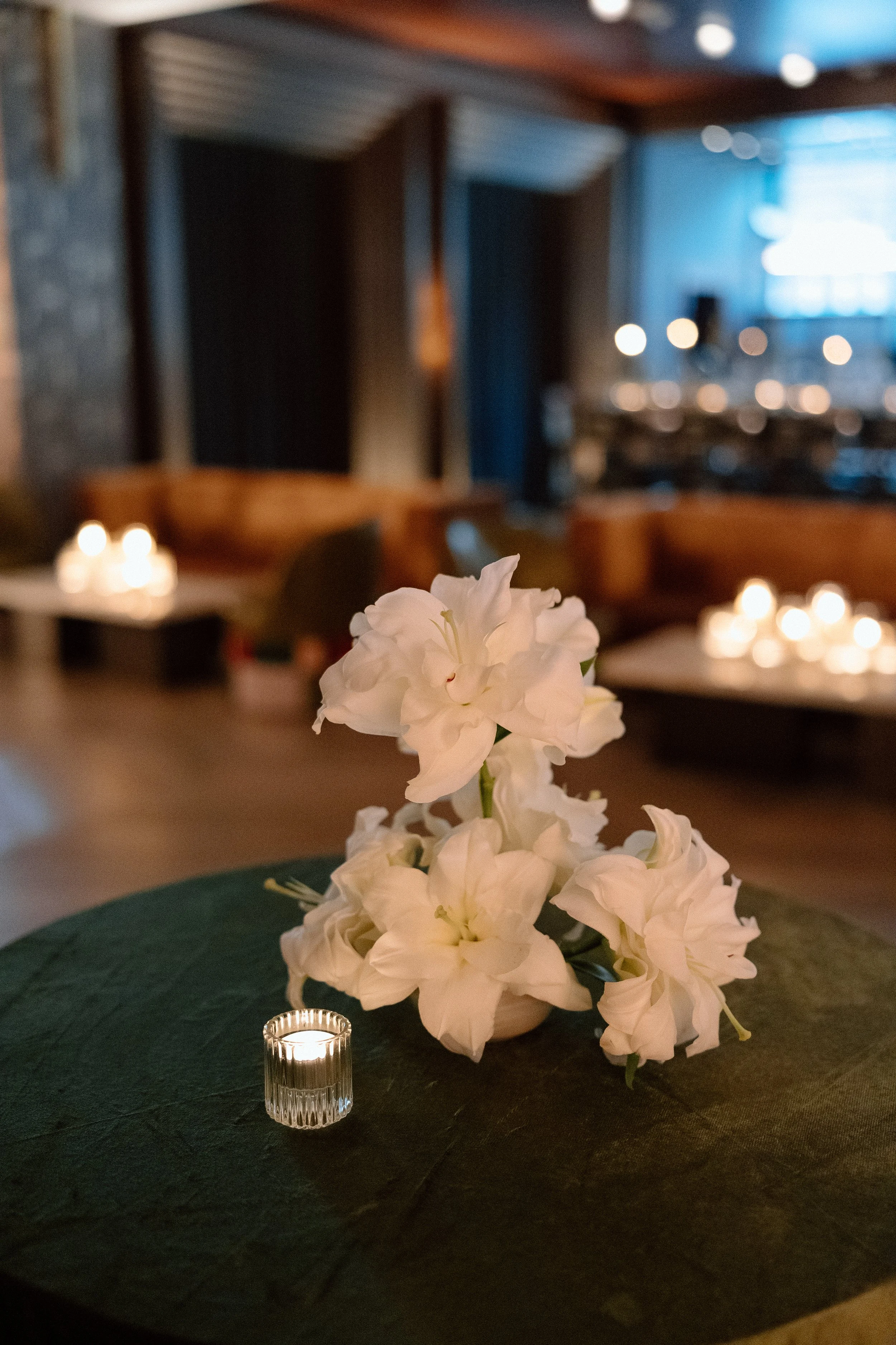
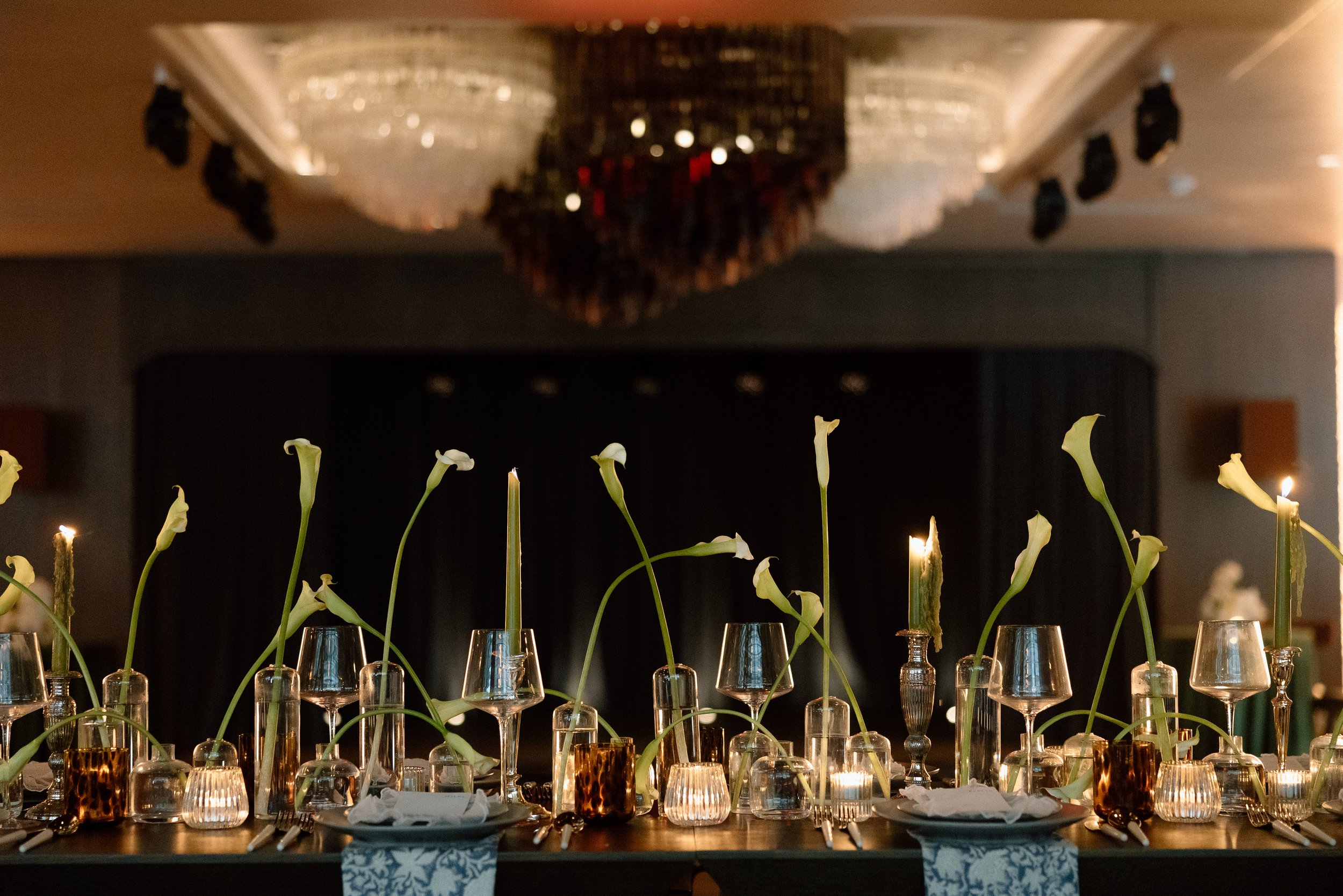
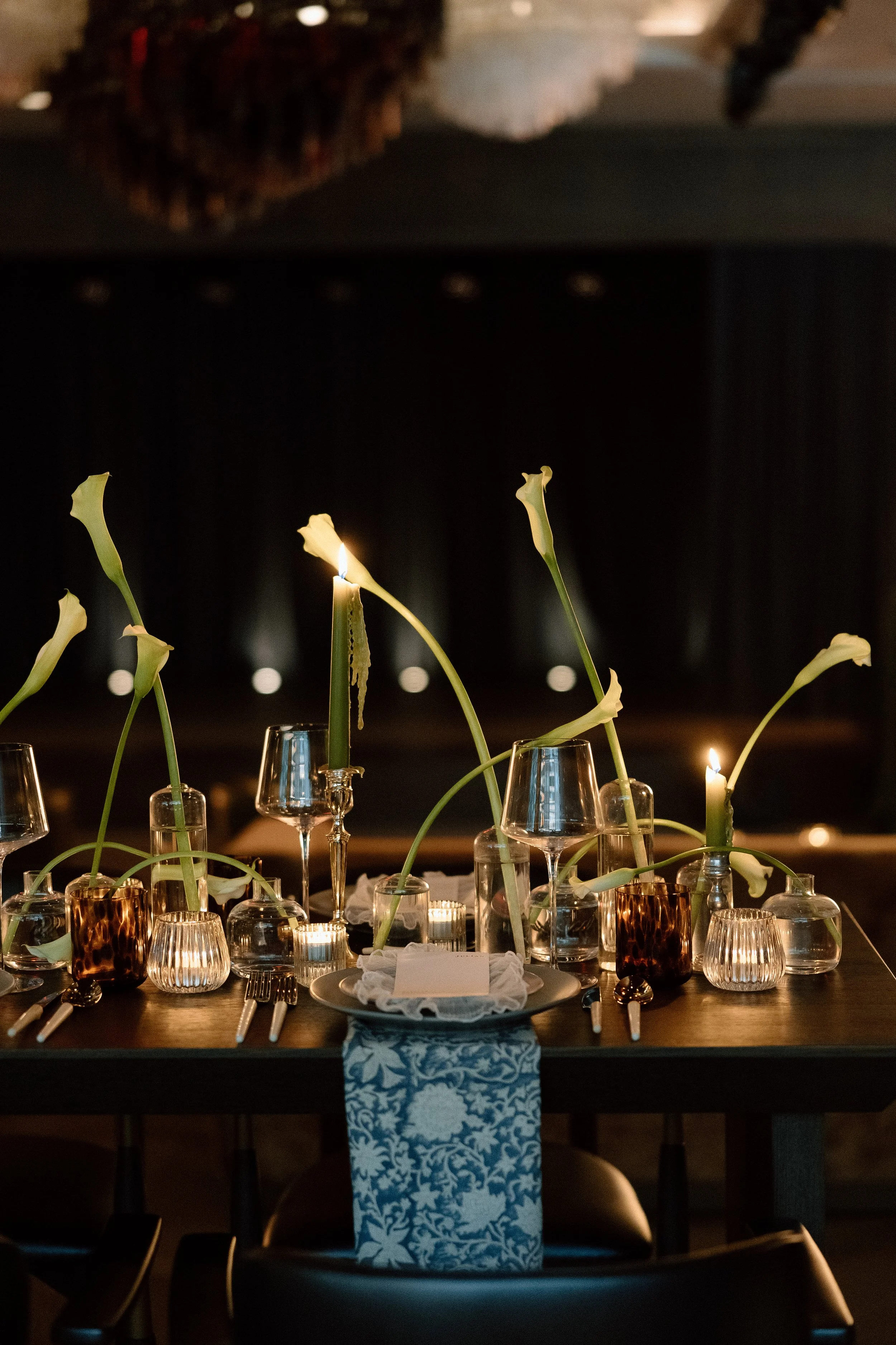
To complement the venue’s rich interiors, we chose a floral palette of white, cream, brown, burgundy, and deep purple. Rather than soft pastels or traditional neutrals, we embraced warm earth tones and wine-colored accents, grounding each design element in the venue’s lush, sultry mood.


A Bar Moment Full of Texture and Story
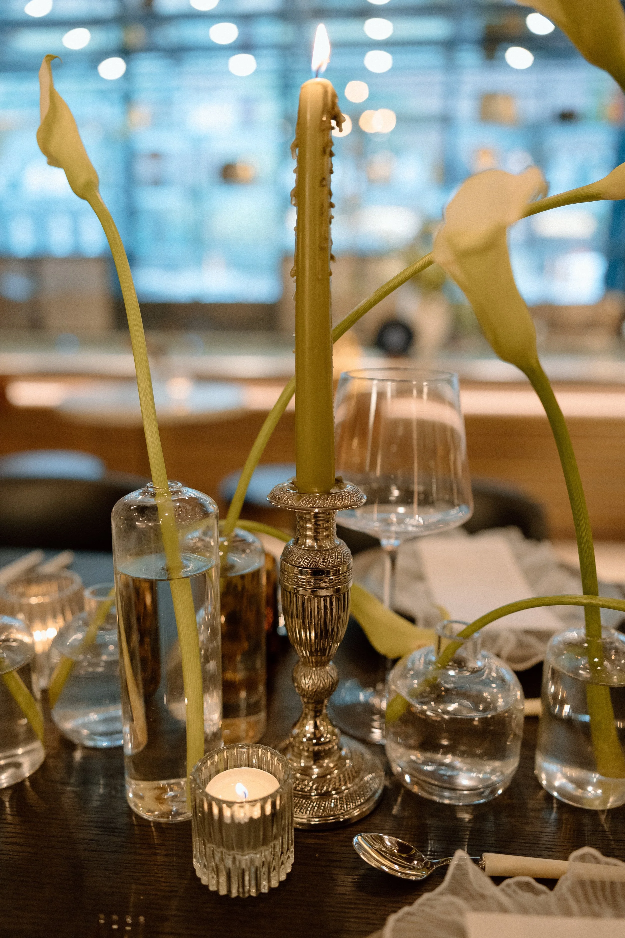
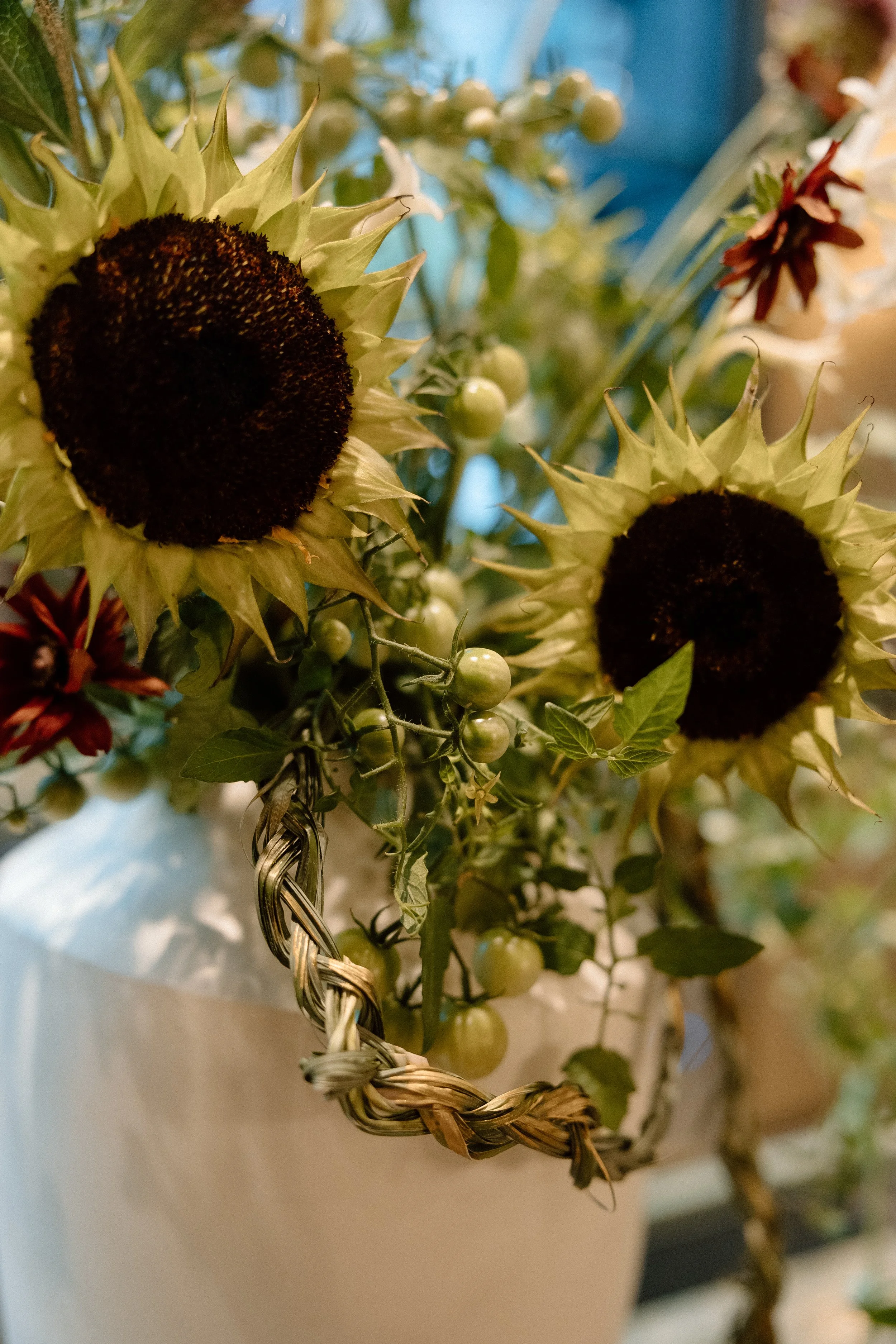
The bar installation was a standout design moment—full of texture, movement, and intentional symbolism. We created a sculptural floral arrangement layered with braided grasses hand-painted with soft touches of gold, evoking a sense of refined drama. Among the unexpected elements were tomato vines, chosen for their twisting, organic lines and thematic presence throughout the shoot. These same vines appeared in the pocketbook-style bouquet and even in the first course on the dinner menu, creating a subtle thread that tied the entire event design together.
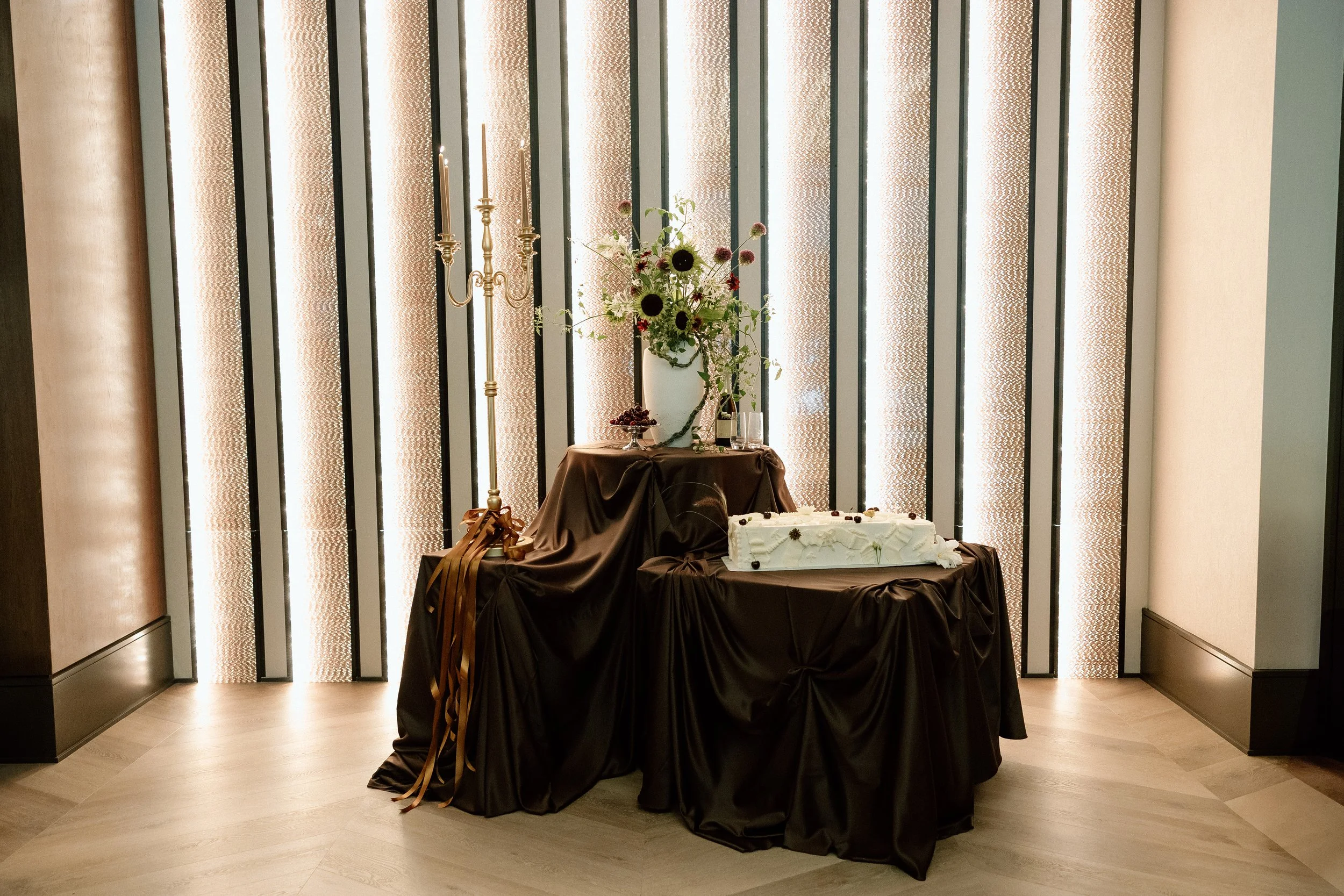
Above the bar, a tall candelabra with green taper candles was adorned with cascading brown satin bows, nodding to both the rich, moody palette and the romantic, layered aesthetic seen throughout the venue. And for a final personal touch, the bar menu was displayed on a vinyl record in a “Now Playing” stand—a playful and meaningful nod to Seratonic’s identity as a music venue. The result was a vignette that felt immersive, artistic, and entirely on-brand for a couple drawn to meaningful details and editorial styling.


Designed for the Bride Who Loves Story and Style
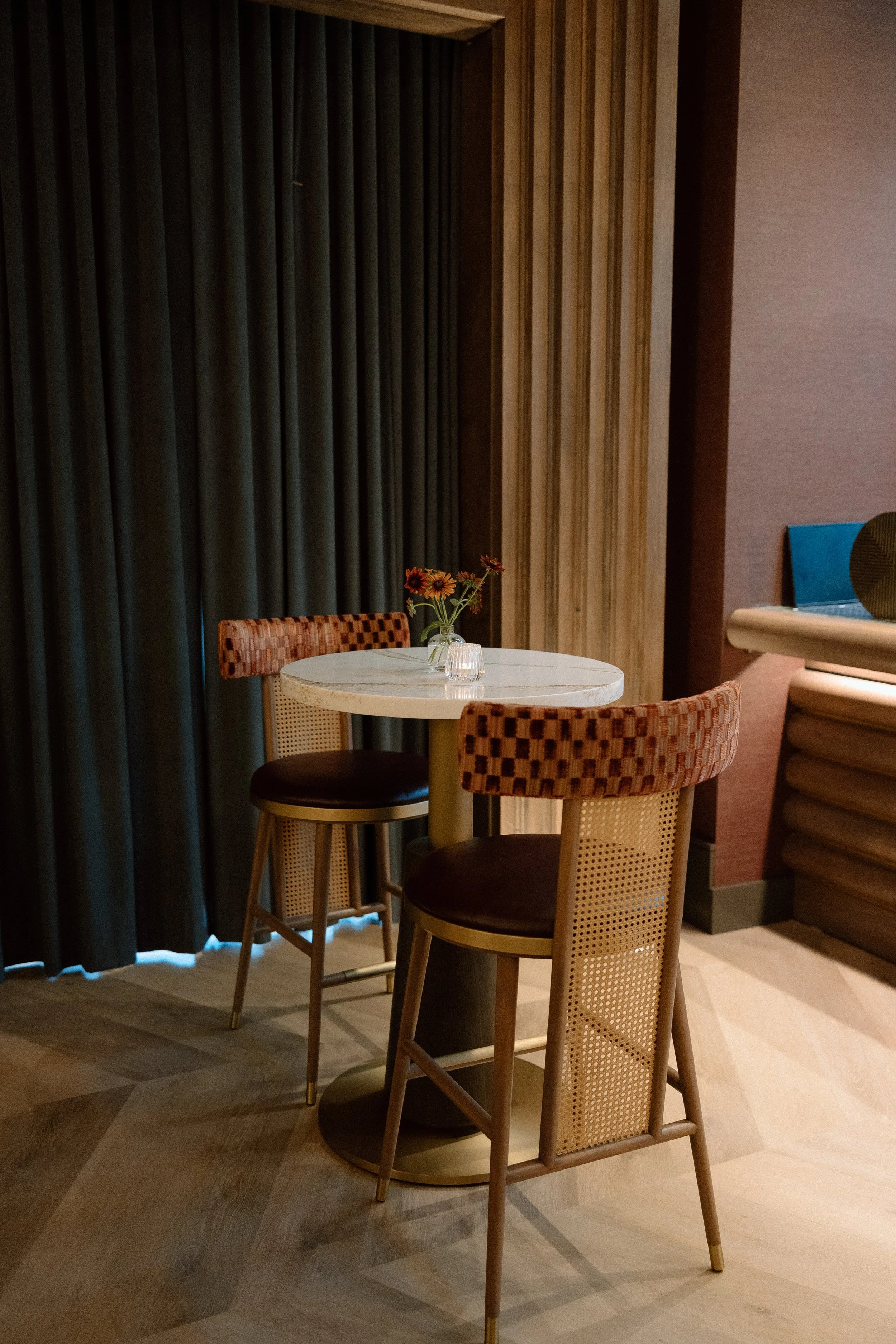
Seratonic offered no shortage of visual inspiration. Every space in the venue—from layered lounge seating to custom wall finishes—was brimming with character. Our role was to enhance the space, not compete with it, styling florals and decor that echoed the venue’s rich textures and artistic tone.
Whether you're planning a wedding at Seratonic or simply drawn to moody wedding aesthetics, this shoot is full of ideas for creating a wedding day that feels both editorial and deeply personal.


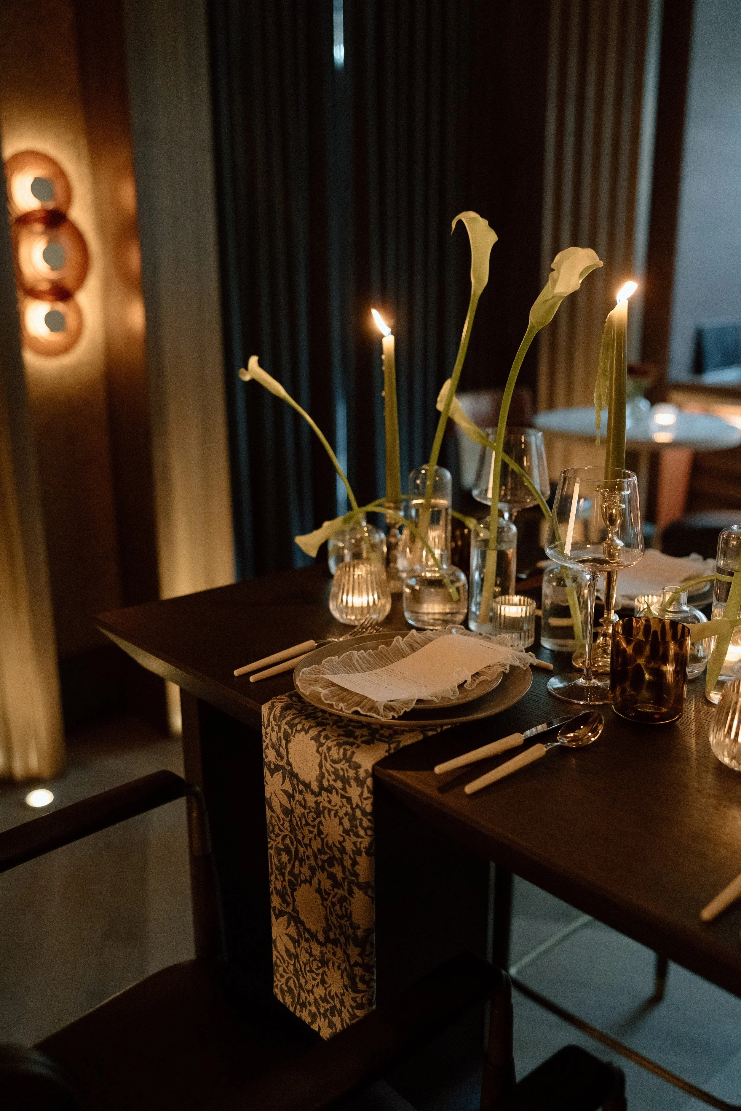
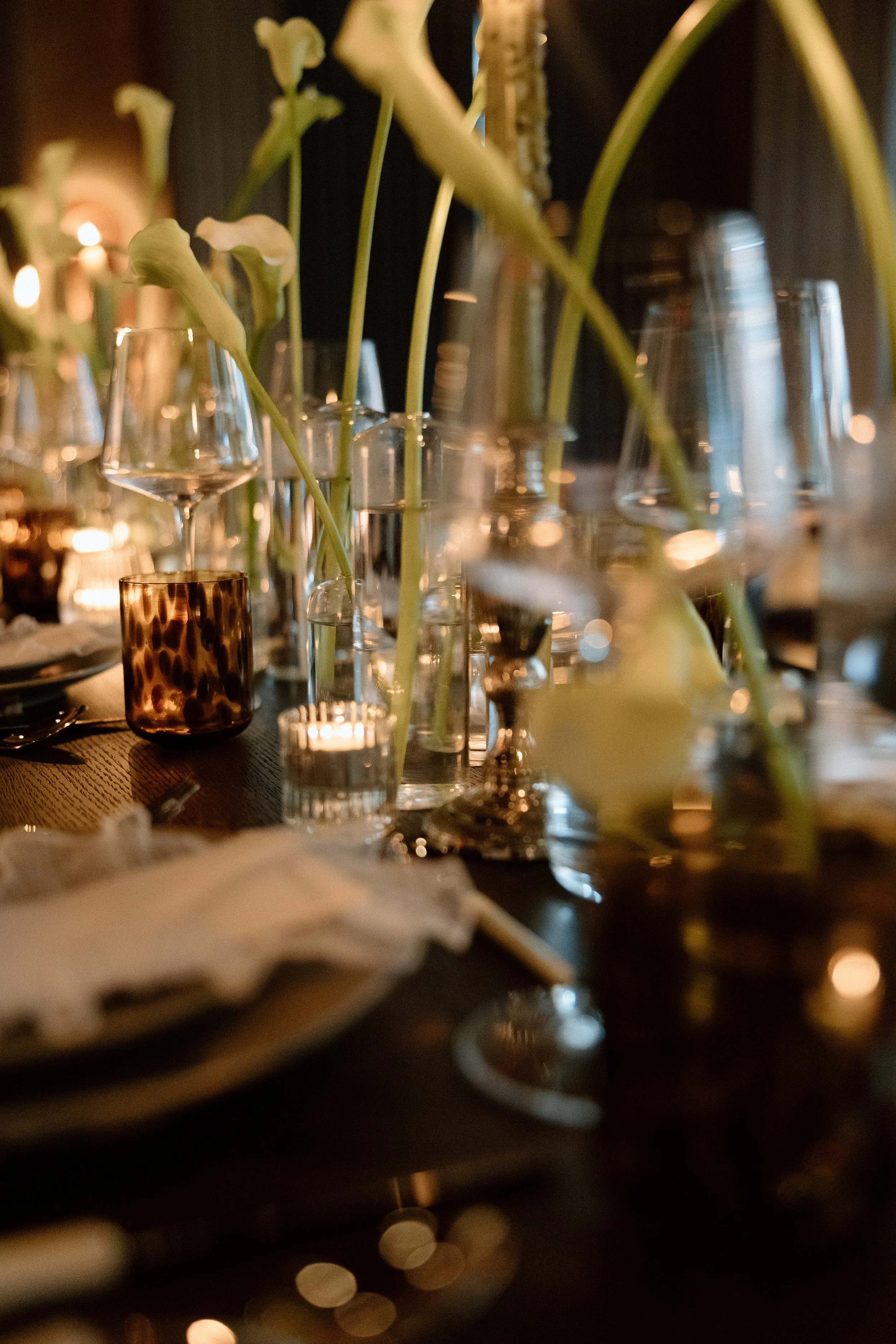
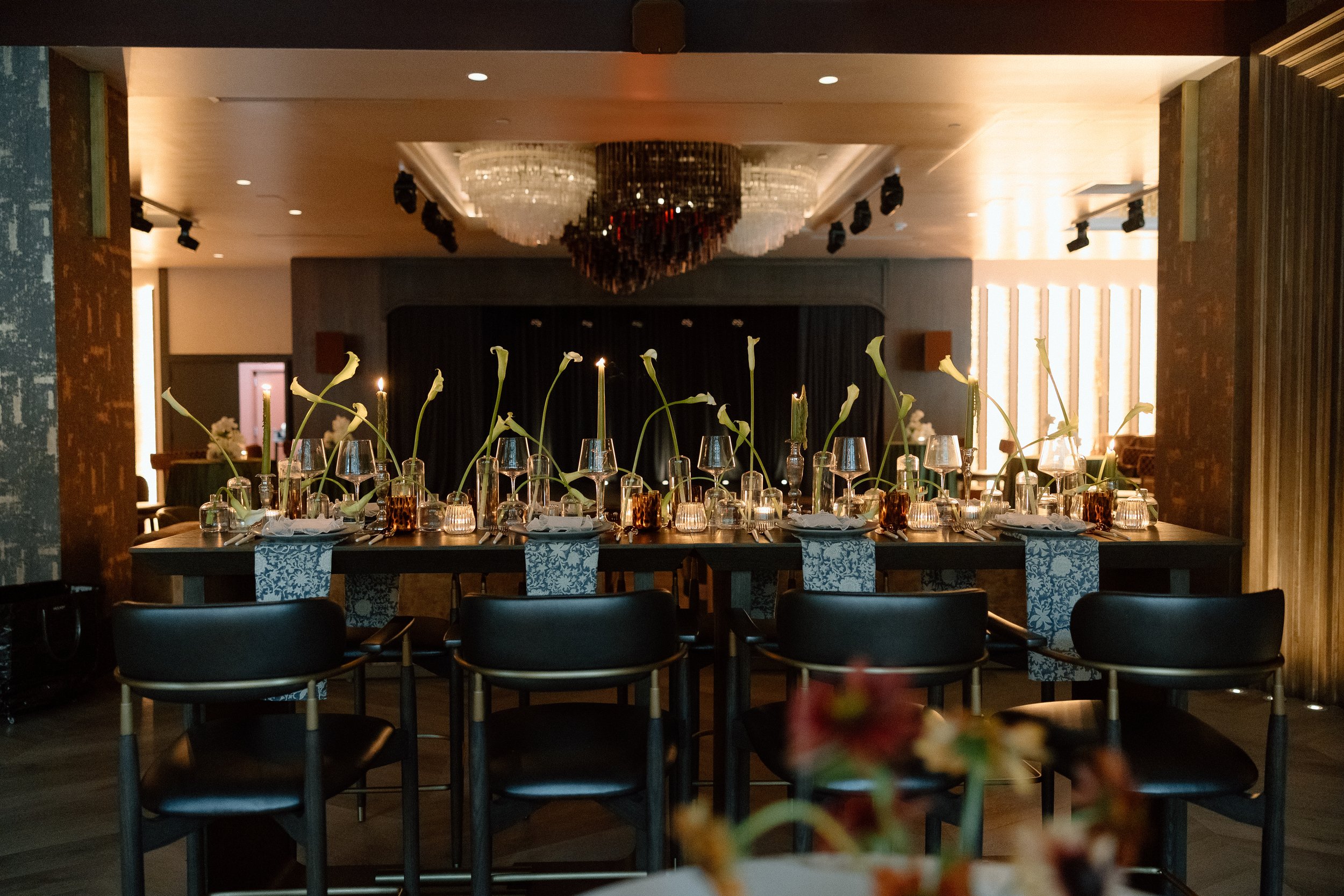
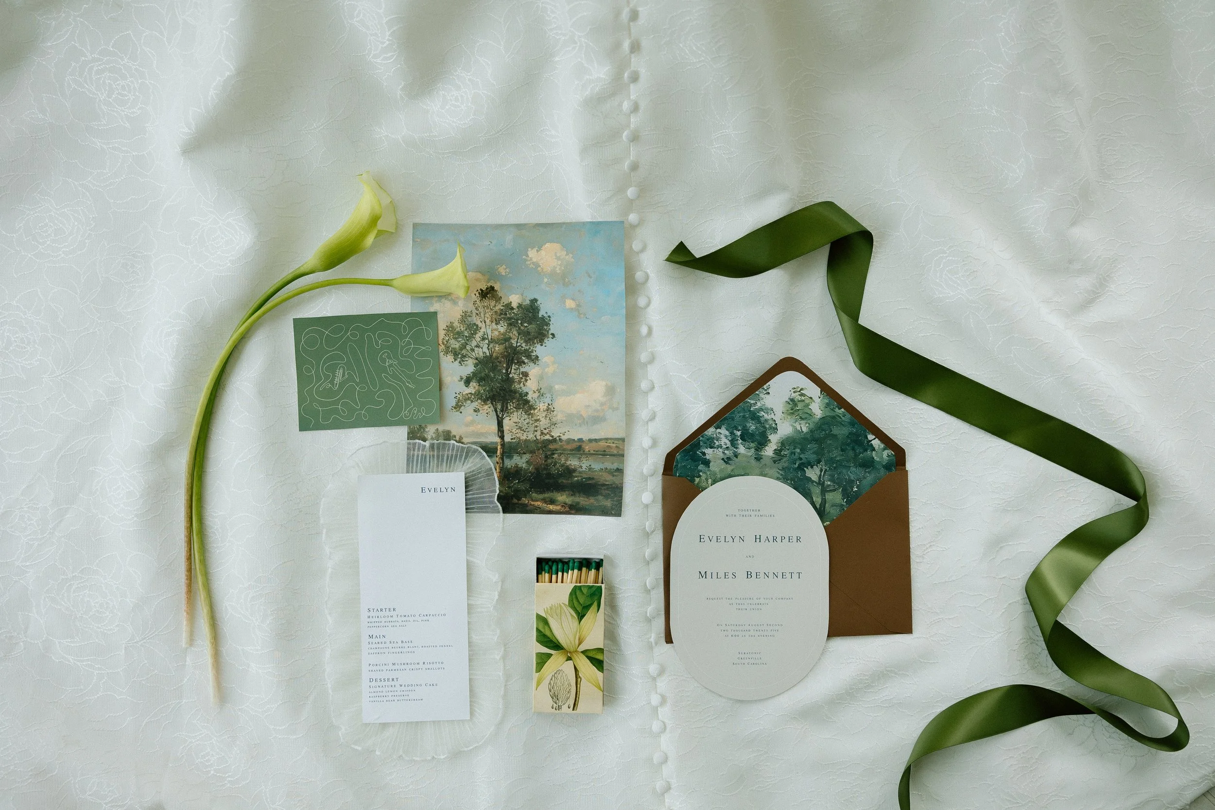
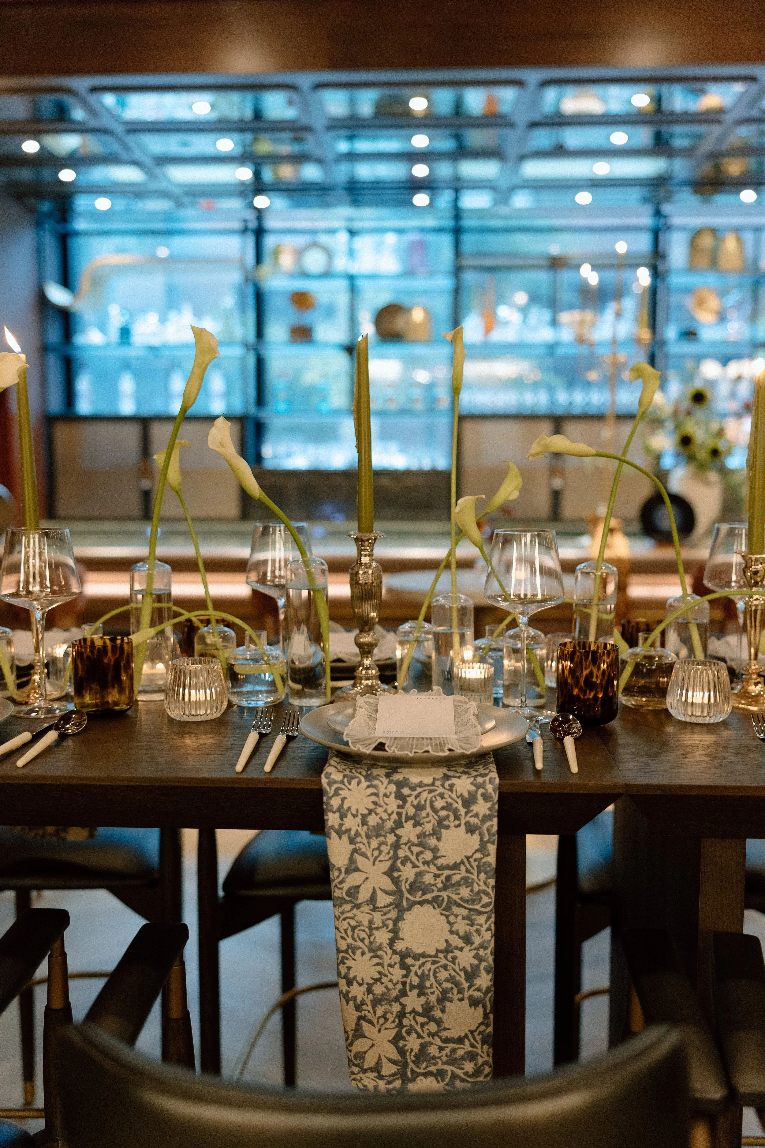
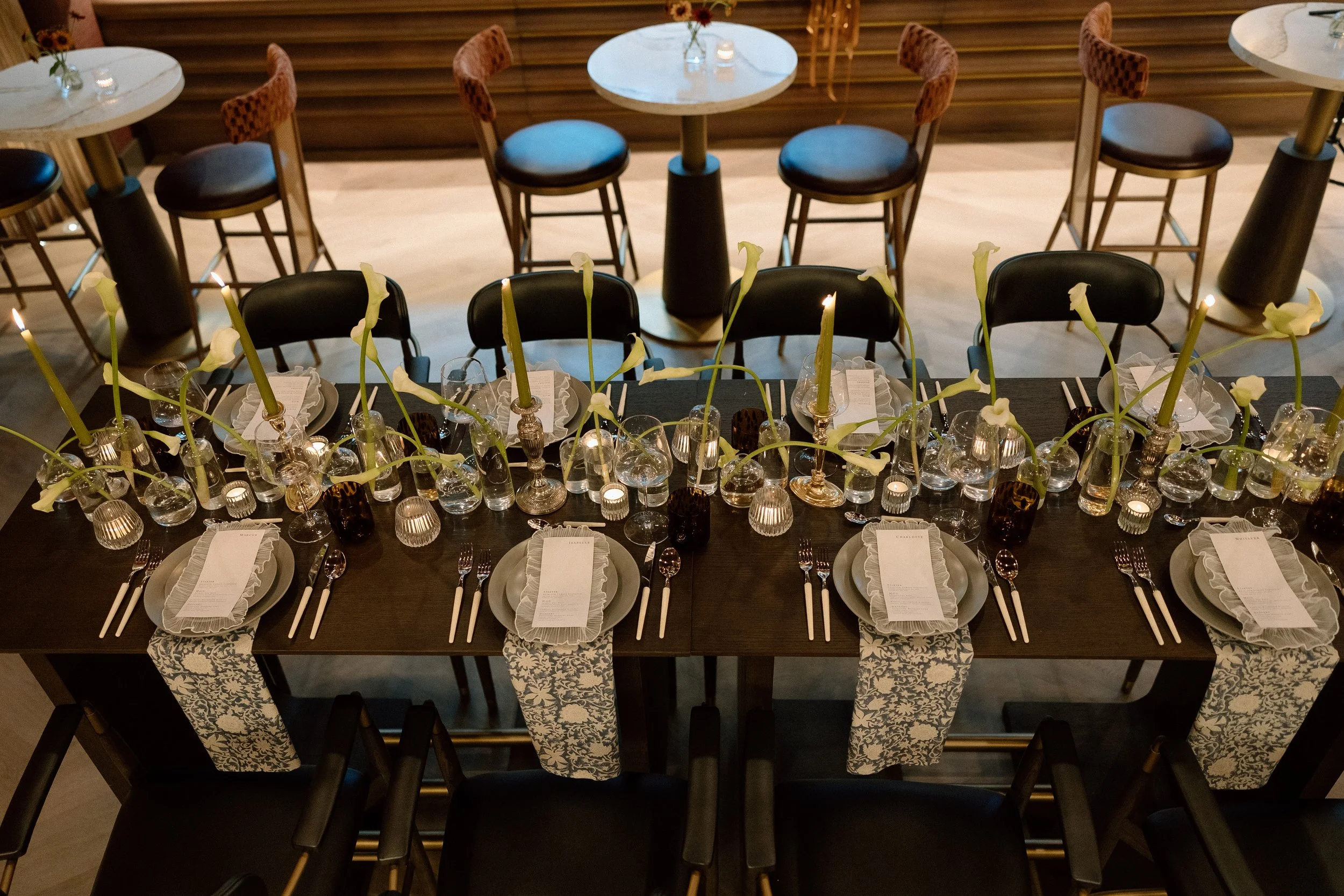
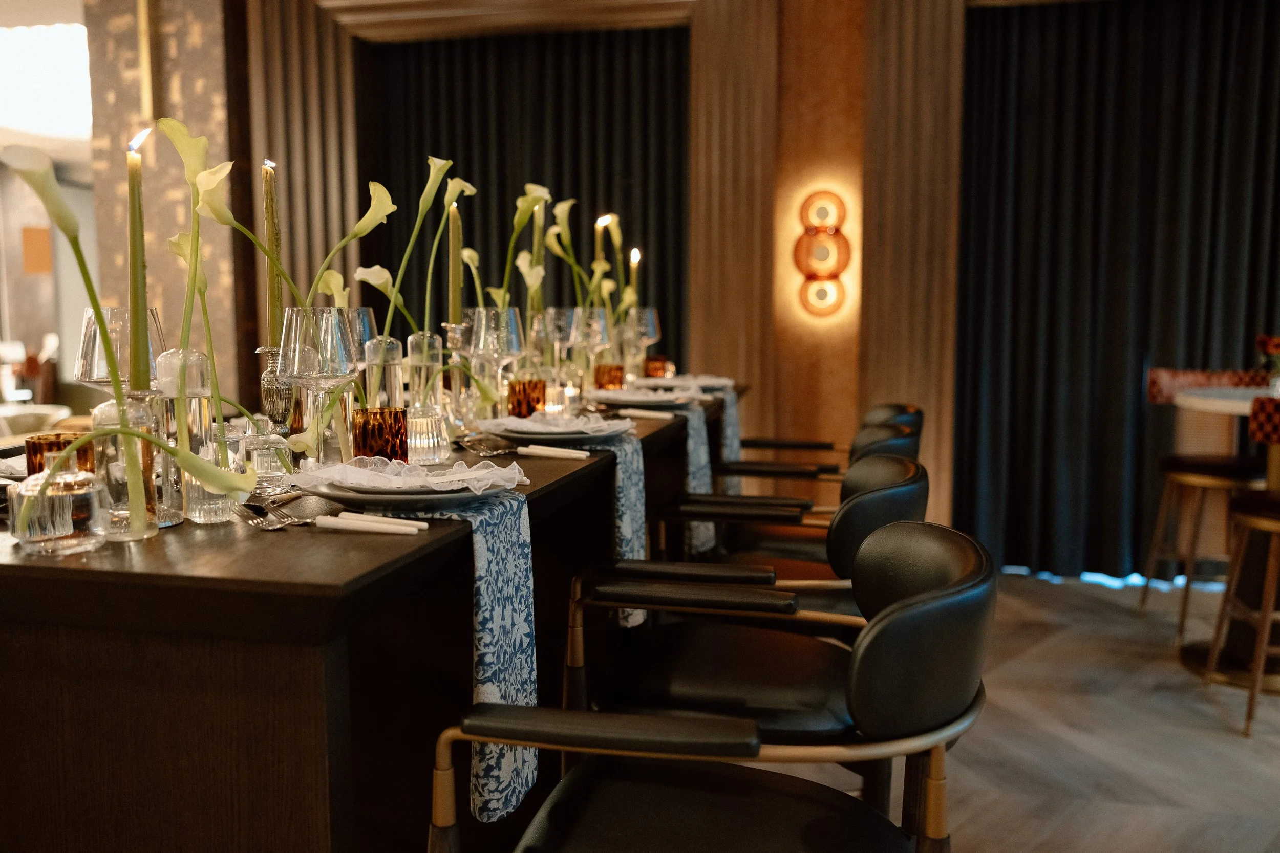
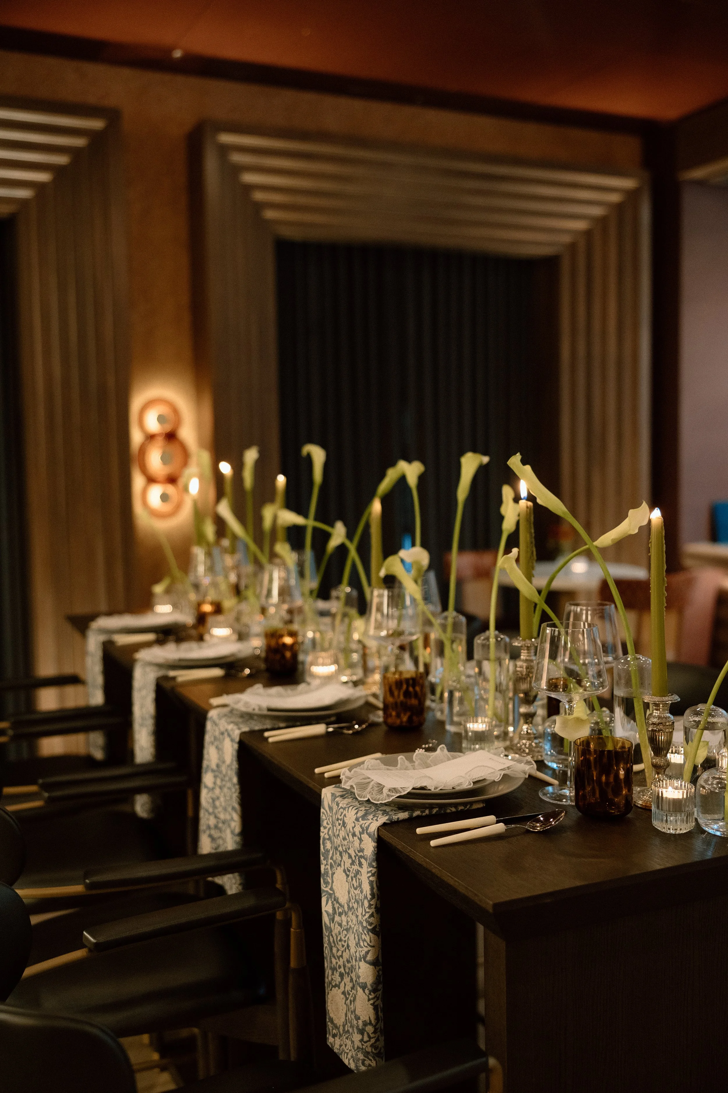
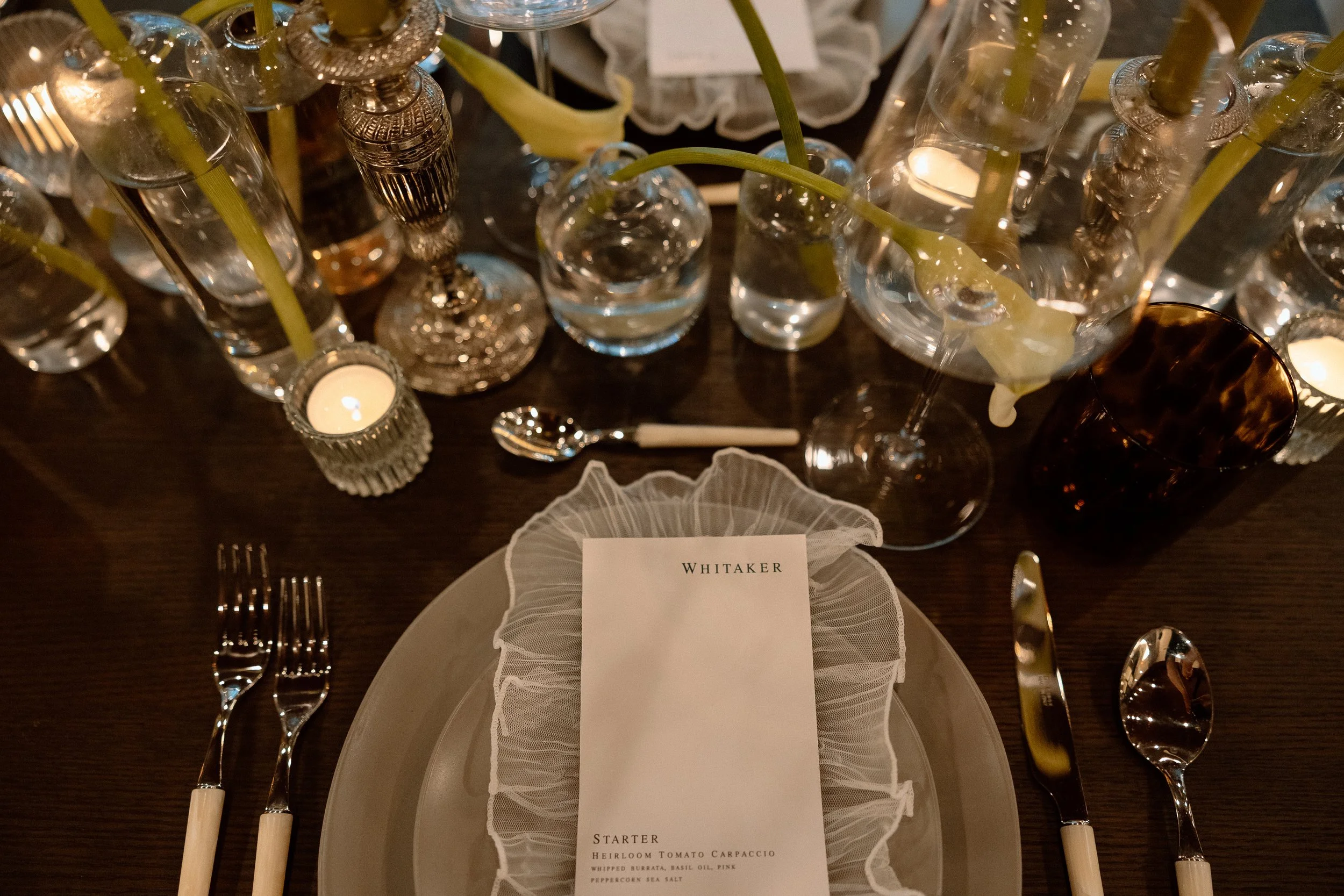
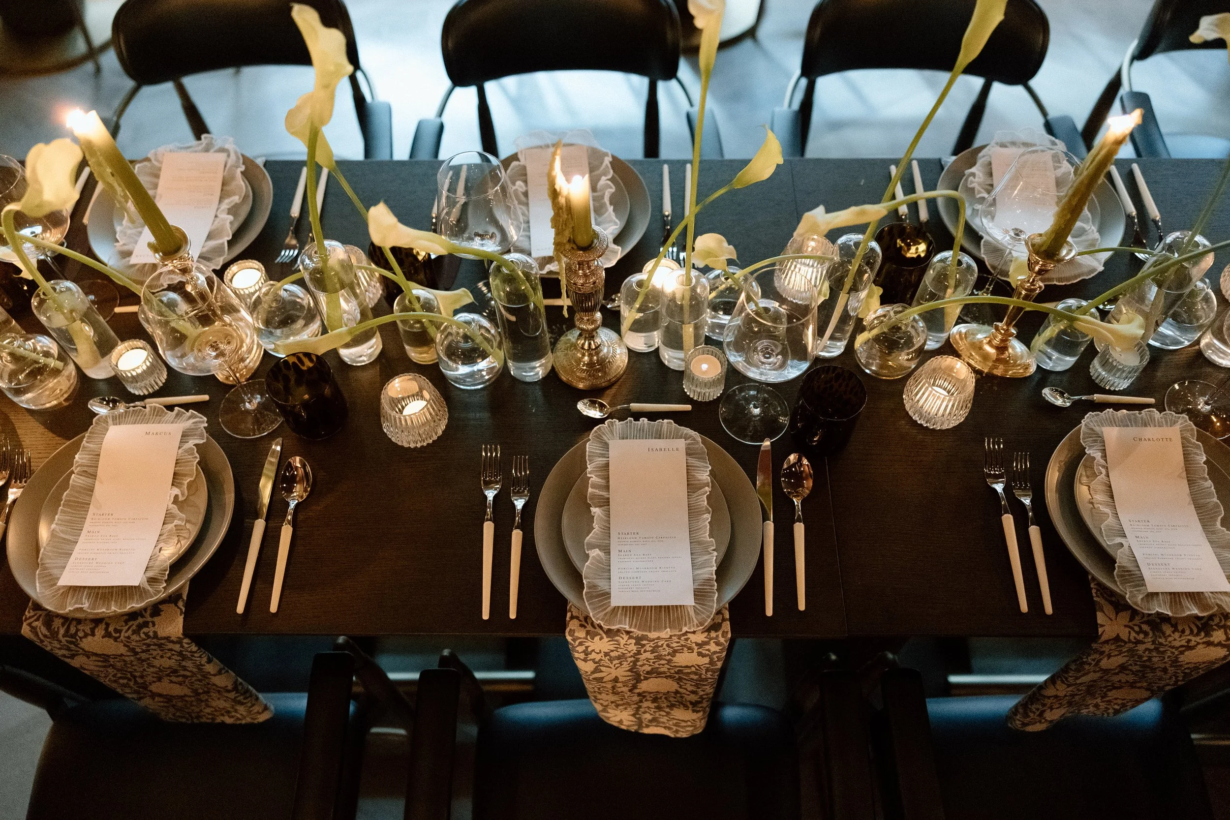
Softening the Space Through Intentional Paper & Textiles
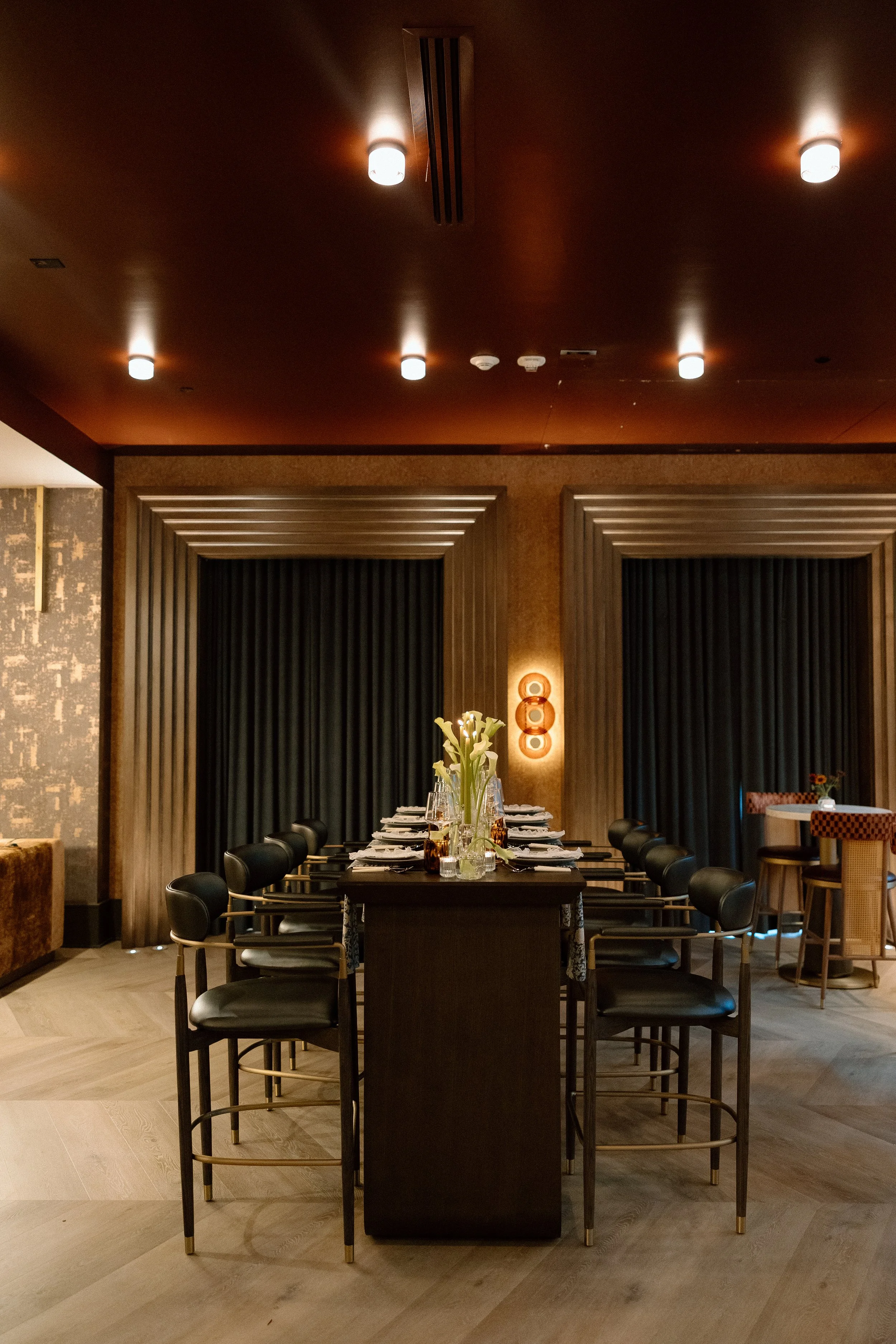
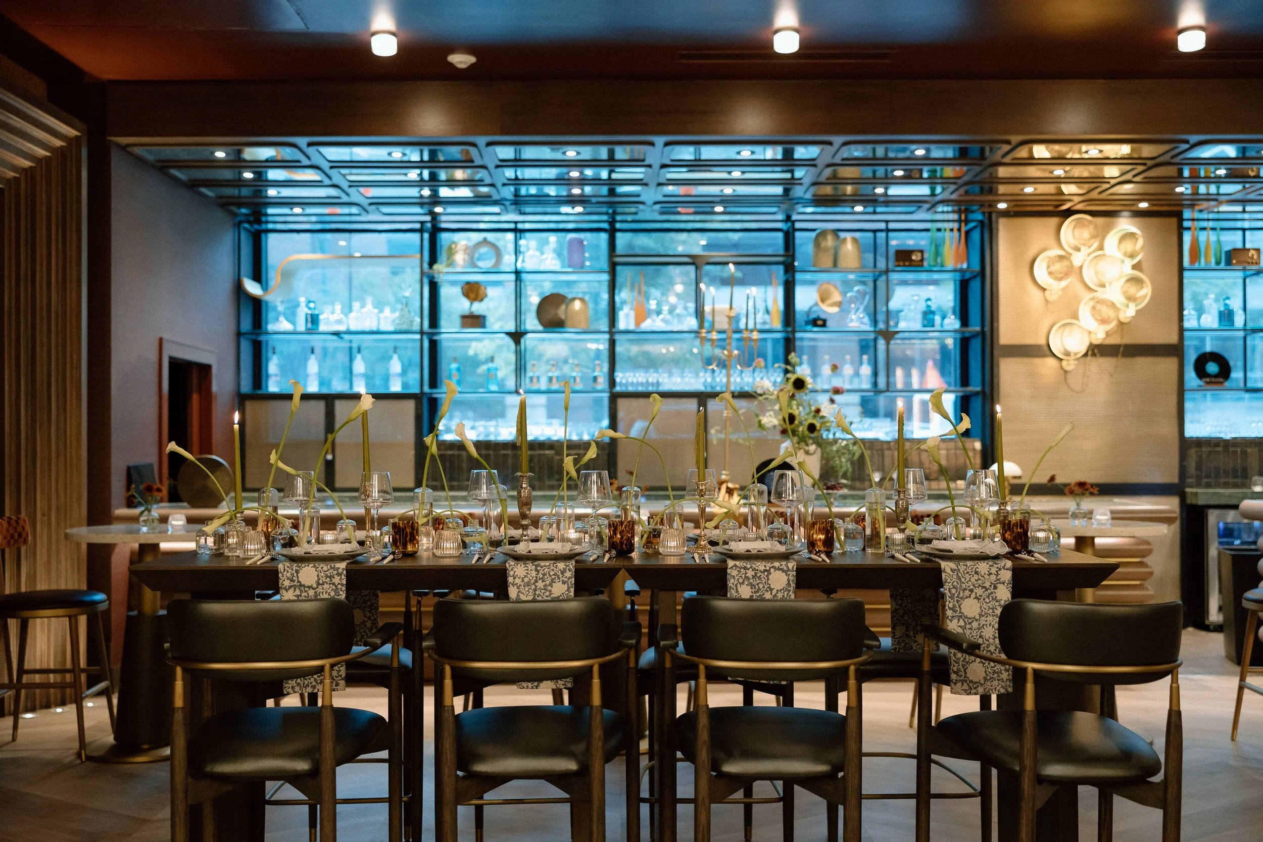
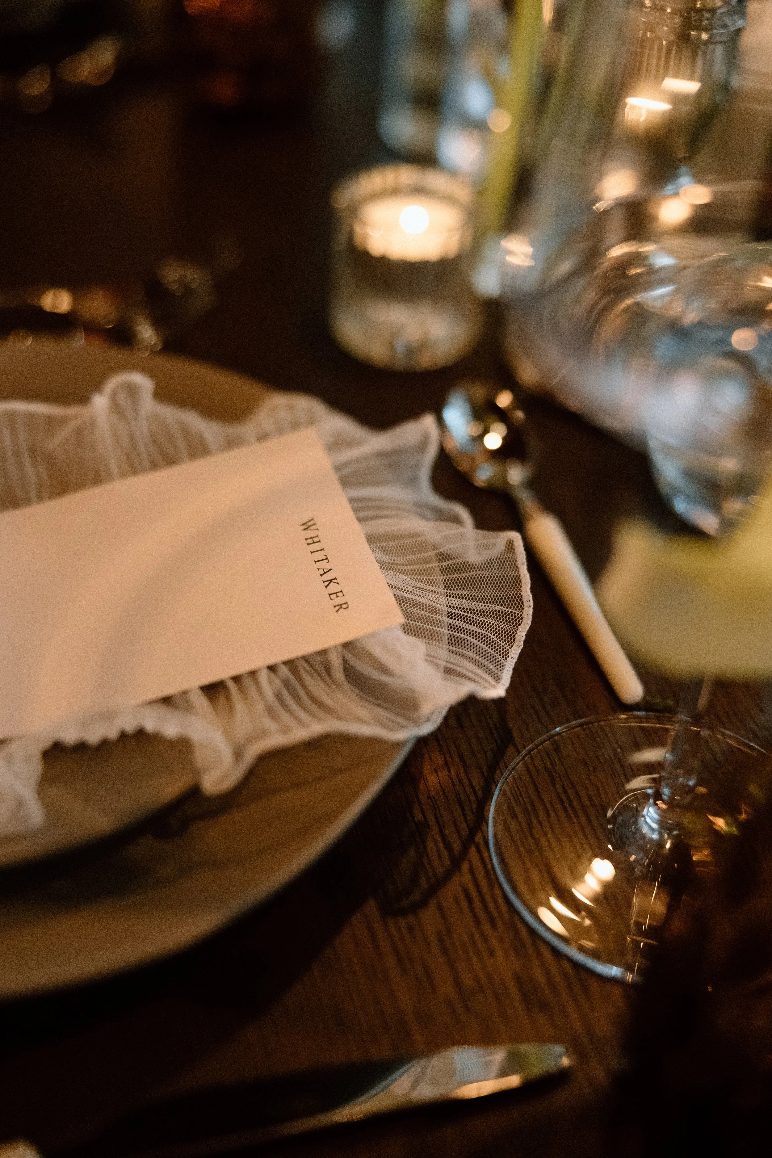
In a venue filled with strong architectural lines and masculine design elements, we were intentional about layering in feminine touches to bring balance and softness to the overall aesthetic. One of the most thoughtful ways we achieved this was through the menu design. Each menu card was edged in a delicate ruffled lace trim, adding a subtle romantic texture that contrasted beautifully with the boldness of the venue.
To further soften the tablescape and introduce both pattern and movement, we incorporated blue block print napkins beneath the plates, allowing them to drape off the edge of the table. This not only added a nod to the blue tones seen in the velvet curtains throughout Seratonic, but also helped ground the design with layered texture and visual interest. These details, while subtle, created a sense of thoughtful cohesion—proof that fine styling doesn’t have to shout to be felt.


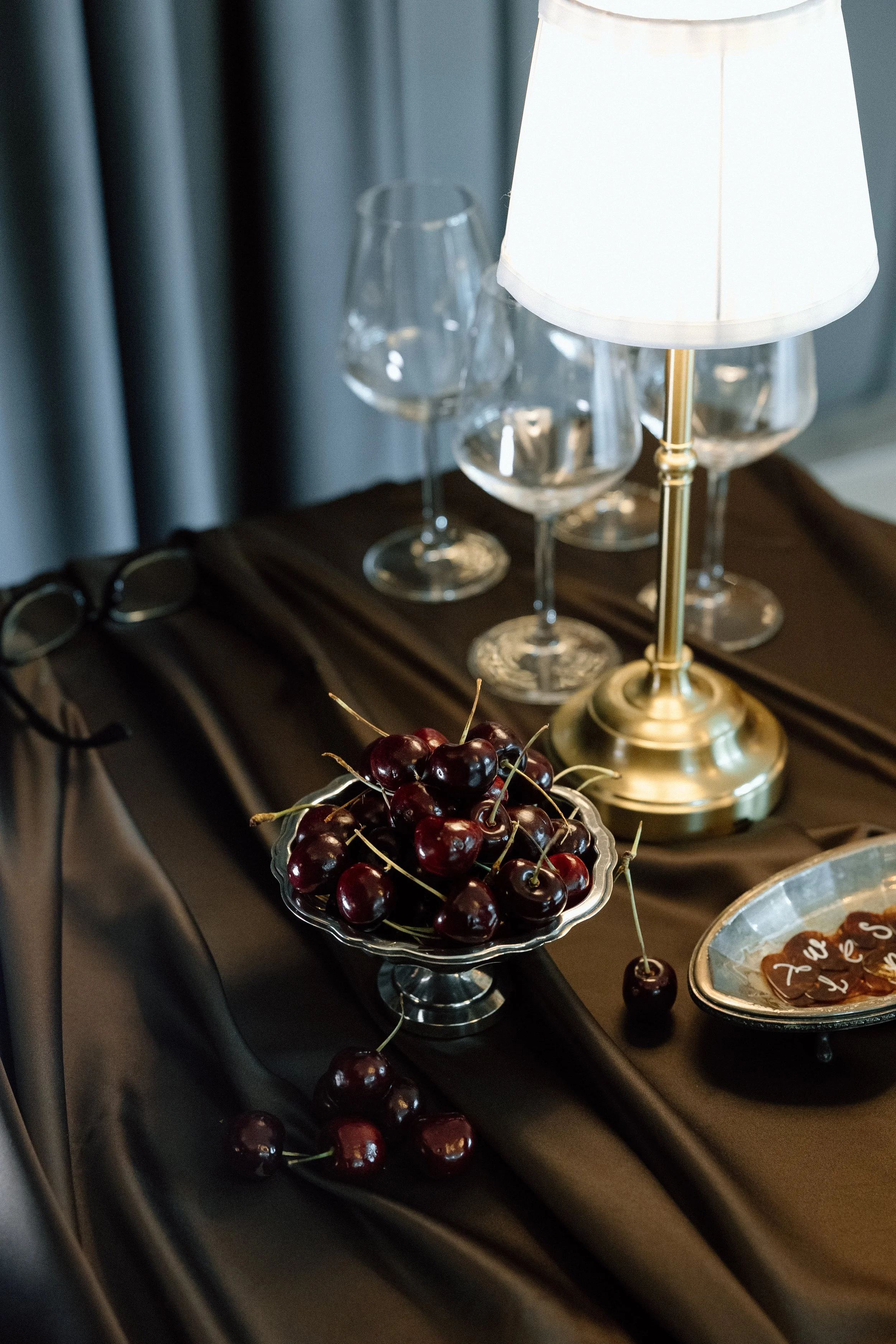

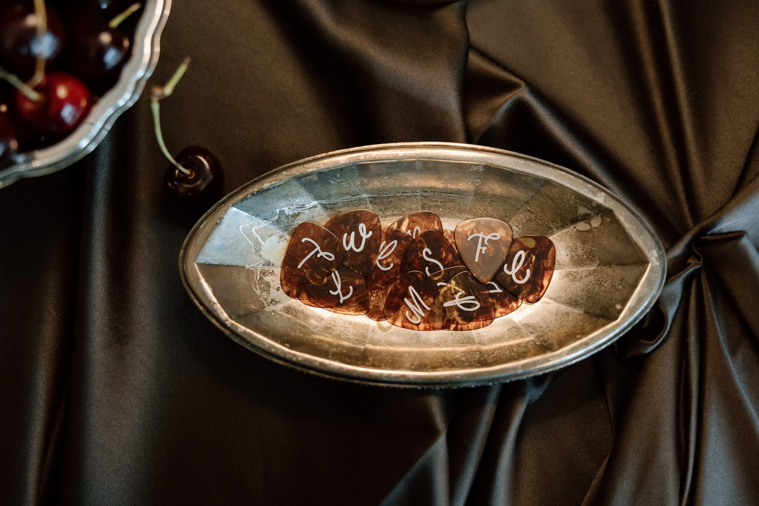
A Favor with Meaning & Style
We believe every detail should tell part of the story—including the wedding favors. For this shoot, we leaned into Seratonic’s musical roots and selected tortoise shell guitar picks as a creative, personalized gift for each guest. Not only did they reflect the venue’s heritage as a music venue, but their warm amber tones also echoed the tortoise water glasses featured on the dinner table, reinforcing our earthy color palette and cohesive styling.
Each guitar pick could be monogrammed by Stephanie of Lettered by Steph, adding a personal touch that doubled as both a favor and a keepsake. The combination of custom calligraphy, thoughtful symbolism, and a nod to the venue’s identity made this small detail feel elevated and entirely intentional—a perfect blend of form and function for the modern couple looking to infuse personality into their wedding day.
Draped Linens with Depth & Intention
As lovers of layered textures, we embraced the current linen draping trend in a way that felt both modern and timeless. For the engraving station and cake table, we selected cool-toned dark chocolate satin linens—a neutral with depth—that allowed us to play with form, texture, and movement.
Rather than crisp, structured tablecloths, we intentionally styled the linens to drape fluidly, adding a sense of softness and elegance to each vignette. This approach allowed us to elevate neutral tones by letting texture take center stage, especially in moments where color was more restrained. Whether catching the light or pooling gracefully at the floor, these satin linens created quiet drama and a sense of curated luxury—proving that even foundation elements like linens can be used as a visual storytelling tool.